For its twentieth edition Typo Berlin opted for cross-pollination, pulling out all the stops to invite speakers outside of its conventional remit of typography and graphic design. Here is Grafik’s pick of the most inspiring, powerful and unusual projects discussed.
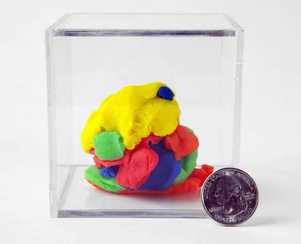
Small Edition, Jon Burgerman, 2014 Small Edition by Jon Burgerman New York-based Burgerman tends to have a twinkle his eye whether working on commercial projects or the numerous self-initiated japes he integrates into his practice. Small Edition is one of the latter and was inspired by a particular work exhibited in the Jeff Koons retrospective at the Whitney Museum last year. The work, called Play-Doh , is a 3m-high aluminium sculpture that perfectly depicts a multicoloured mass of the modelling clay. A feat of engineering that took twenty years to develop, each of the coloured elements are cast separately and slotted together to create a fiddly three-dimensional jigsaw.
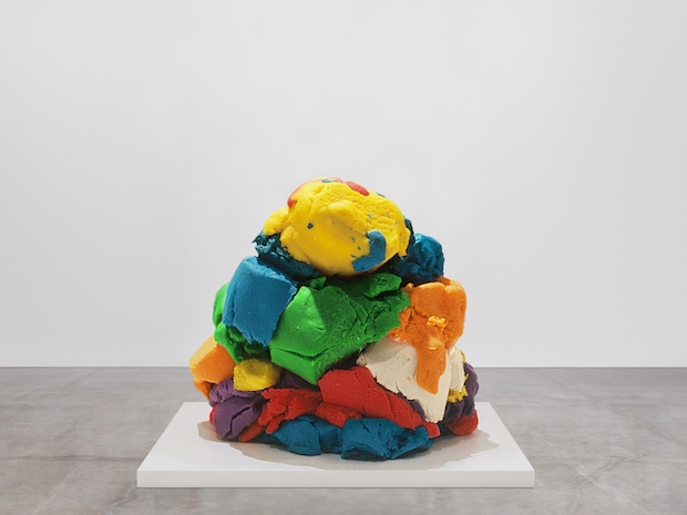
Play-Doh, Jeff Koons, 1994–2014. Bill Bell Collection. © Jeff Koons During the exhibition Burgerman set up a stall outside the Whitney’s dense queue to sell his Small Edition sculptures, replicas of the artwork Play-Doh actually made out of Play-Doh. “It is more real than the real thing,” writes Burgerman on his website. “Instead of taking 20 years to make, it only took about 20 seconds.”
VIDEO
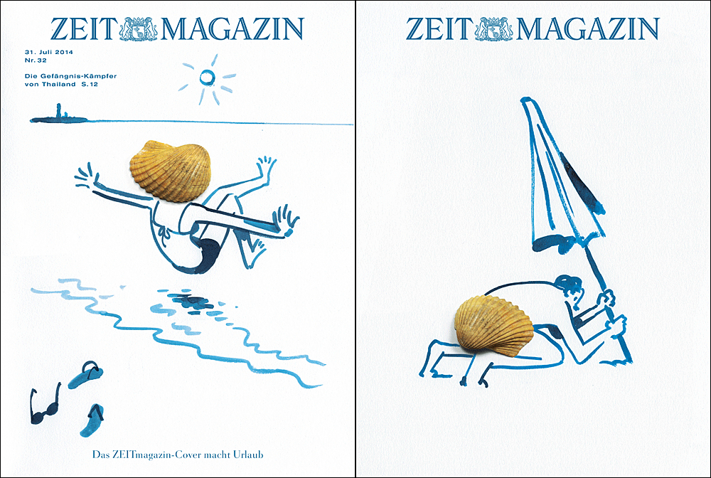
Christoph Niemann for ZEITmagazin, 2014 ZEITmagazin’s Christoph Niemann double cover
In 2007 ZEITmagazin were faced with a pretty normal dilemma in the editorial world: they had two exceptional potential covers and they couldn’t decide which to run in the next issue. Then a brainwave, why not print both? Ever since that day, the weekly magazine has published what it calls a double cover, where both the first and second left hand pages (so page one and page three) are given over to cover images. The result is a pretty much unique experience for illustrators, designers and other creatives to develop two pieces that have a dialogue with each other. ZEITmagazin’s Editor in chief Christoph Amend took the audience at Typo through a number of smashing covers, including this summer special by Christoph Niemann. Niemann was also the headline speaker at the festival, using his slot to give a charmingly illustrated talk about how hard graft is essential for taking your illustration practice to the next level. Simple and showcasing unabashed enjoyment of the seaside, this double cover perfectly sums up what summer should be about, and so much more impressive than the normal tripe you find on page three.
Mistletoe Drone, George Zisiadis, 2013 Mistletoe Drone by George Zisiadis Totally out of season but so joyful we had to share, this project by designer-inventor-artist George Zisiadis was created to prompt spontaneous interactions between strangers in San Francisco over the Christmas period. Without any planning permission or prior warning, Zisiadis and his team hovered a drone above ice skaters at a San Francisco rink and captured the results. As Zisiadis said in his Typo talk, “If you are questioning your sanity at any point during the project, then you’re probably doing something right.”
Positive vibes are at the heart of most of Zisiadis projects – whether developing merry-go-round benches or placing gongs in unused bike racks to make temporary musical instruments – but his pieces also act as urban interventions that encourage inhabitants to reclaim their cities and talk to each other. For some truly feel-good vibes, take a look at the video above.
The Spew Bag Challenge, Gemma O’Brien, 2013 The Spew Bag Challenge, Gemma O’Brien, 2013 The Spew Bag Challenge, Gemma O’Brien, 2013 The Spew Bag Challenge by Gemma O’Brien
Recently featured in Oli Frape’s type-themed Take Five here on Grafik, Australian illustrator Gemma O’Brien has made her name by inventively hand-lettering motivational phrases and feel-good mantras. Never one to sit still, she set herself the Spew Bag Challenge two years ago, using every flight she took, long or short, to illustrate a sick bag with a related pun. The project gained a lot of traction over the Internet with other illustrators and followers also taking up the challenge. She exhibited the work in a show last year. Excellent proof if you need it that everything can work as inspiration and there is no such thing as dead time.
Unfinished Father, Erik Kessels, 2015 Unfinished Father by Erik Kessels Advertising maestro Erik Kessels’ talk was so full of laughs, we really didn’t see this one coming. Extremely moving and obviously really heartfelt, Unfinished Father was a project started by Kessels after his dad suffered a stroke which left him unable to speak or move. Kessels Senior was a great lover of cars and spent his time painstakingly restoring Fiat 500 Topolinos, even carving and hand-finishing the steering wheels in an marriage of both patience and finely honed craftsmanship. Before his stroke he was halfway through finishing his fifth model, and as you can imagine, the symbolism of this never-to-be-finished project struck a certain chord with the younger Kessels. His father had meticulously documented his progress when bring the cars back to life, and although not a photographer, Erik Kessels noticed a certain flair about the way his father captured these images. As Kessels syas, “He was a man who didn’t like to leave things undone, who saw them to their end. We can attempt to control our circumstances, but in the final analysis they control us.”
Transporting the last Topolino to Italy, Kessels created an exhibition for the Fotografia Europea exhibiting his father’s images and iterating the art object quality of some of the car’s unfinished parts. Like much of KesselsKramer’s output, this project was thoughtful and unexpected, but the depth of feeling and willingness to bare such personal sorrow is something really quite rare in the design world – and incredibly powerful.typotalks.com/berlin