Adopting Britain at London's Southbank Centre aims to celebrate the positive contribution of migrants to the UK. Here PLAID's Brian Studak gives us the lowdown on designing the interactive exhibition.
How did this project come about?The Southbank Centre contacted Plaid at the beginning of the year and asked us to develop a creative pitch for the project.
What was the original brief and did it change at all?
The client wanted to create an exhibition to both illuminate and open up for discussion the topic of immigration in the UK to coincide with the national elections. Adopting Britain delves into some of the personal stories of migrants and refugees, it celebrates the contribution of migrant groups to Britain’s artistic landscape and, most importantly for us, the exhibition provides a platform for visitors to actively share in the discussion.
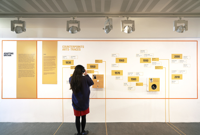
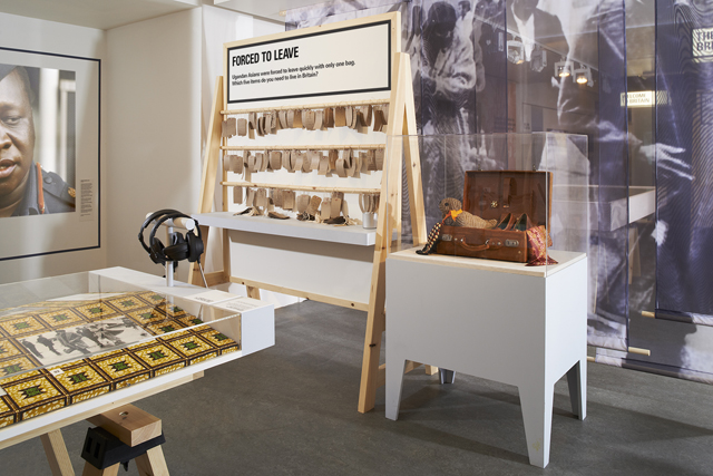
The content ranges from very emotional first-hand migration accounts to art works and design objects created by immigrants to providing participation experiences for the gallery visitor to leave their stories and thoughts. The brief was to create an exhibition design which would help stitch together all of these fairly disparate elements as well as shape the visitor experience. As the exhibition developed and the content became apparent, the role for design to pull together the exhibition became much more prominent.
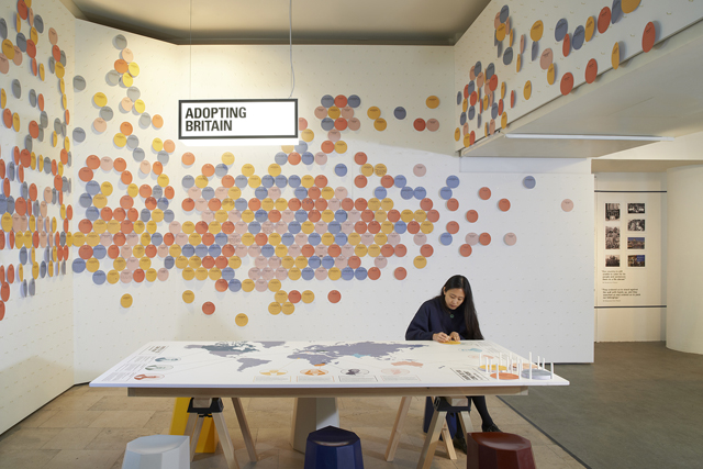
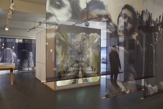
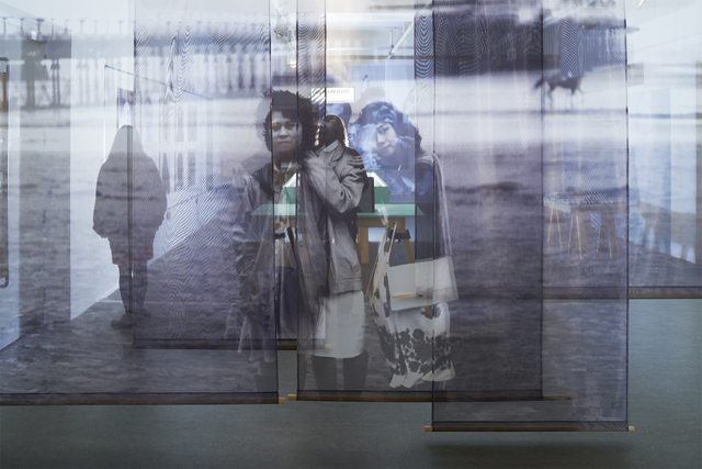
Did this project involve sourcing any new materials or using any new processes?Our pitch proposed creating large scale graphics on translucent hanging curtains to modulate the space. The gallery is long and thin: the curtains broke the space into sections whilst providing high-impact contextual backdrops, face-on to visitors looking down the length of the gallery. Whilst not a new process, the scale of the digitally printed translucent fabrics we wanted to use was something less usual - up to 3 or 4 metres wide. To attain these sizes, each image was broken down into a series of layered panels, which added a further sense of lightness and abstraction.
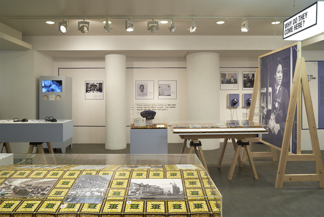
Did the subject matter present any particular challenges, and if so how were these overcome? One of the main challenges was how to display serious and often highly affecting personal stories in a very approachable way for the audience. It was super-important for the content to appear digestible in order to engage visitors. In addition to functioning as a navigational tool, the use of colour applied to the furniture and graphics (two complimentary tones in every section) helped greatly to lift the mood of the exhibition.
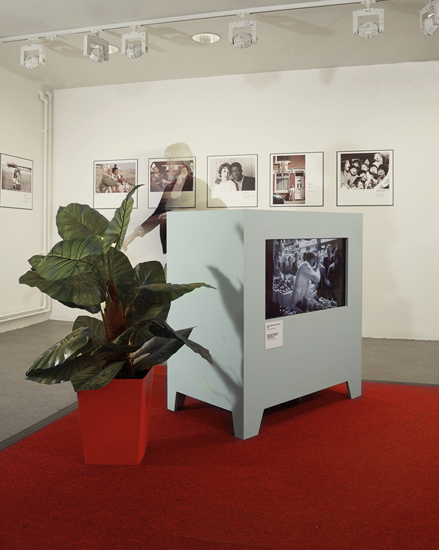
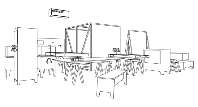
Did working on this project change any of your attitudes or preconceptions?Due to a very tight production schedule we decided to design very simple build elements as more complicated designs would have been a risk. This way of working, keeping elements simple, almost brutal has provided the design with a very confident system of parts and has made us rethink slightly our design ethos.
What are the challenges faced when creating a participatory exhibition?Participation provides a two-way conversation between the museum and visitors. Most exhibitions don't ask visitors to play an active role in creating content and many visitors are not used to that activity. This means we really have to entice them into being part of the conversation.
Design plays a pivotal role in attracting people to participate and in forming the engagement. We've found the more intuitive the participation process the greater the engagement. As such, analogue experiences can be more effective than digital ones and are often more “personable”.
Which aspects do you think have worked particularly well?
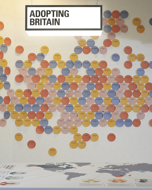
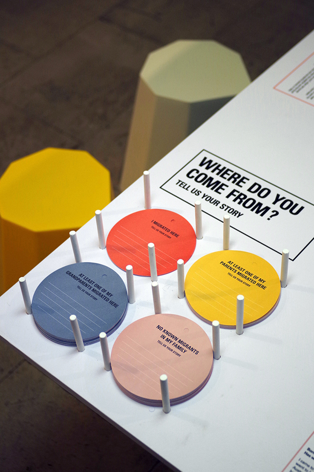
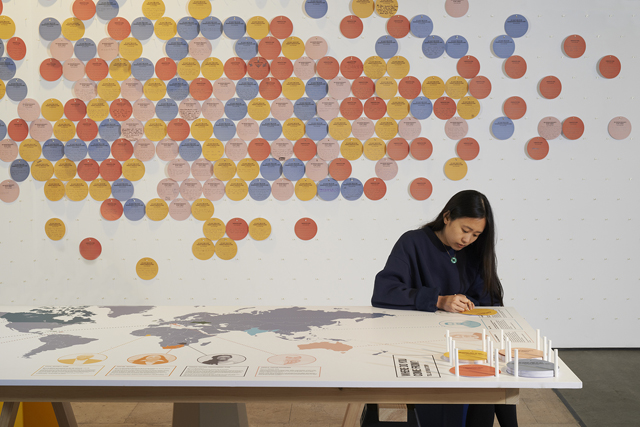
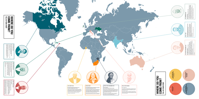
We are very happy about the entrance to the exhibition. This area is devoted to a participation activity which asks visitors where they or their family come from. It's a simple mechanism which helps to submerge the visitor personally into the subject of migration. The visual result is striking with 3m high wall covered by hand written cards which engage visitors from a distance as well as at a readable distance. When last we visited there were probably over two thousand personal stories arrayed on the walls.
What’s been the response from the client and visitors so far?It's been very exciting to see social media responses popping up - which have been very positive and it seems that the exhibition is striking a note with many people. The Southbank Centre has been extremely supportive through the whole process and are very happy with the design.
What’s next for Plaid?We have projects ongoing with British Library, Design Museum and Wellcome Trust. We are also developing our commercial folio with retail work in Asia. Adopting Britain is our second project where PLAID produced both the graphic and spatial designs in house. This enhanced capacity is something that we will be developing further on our project with the British Library and in future work. Project team: Chloe Leen, Margot Lombaert, Juri Nishi
See more of PLAID's work here
Photography by Leon Chew
Adopting Britain
Ends 06 September 2015
Southbank Centre, London

