
What happens when you print an entire book on transparent paper? Melanie Mues reveals the ideology and technical challenges of her design for photographer Olivia Arthur's latest work...
How did the commission to design Stranger come about?
I established a working relationship with Olivia when I designed her first ever book publication Jeddah Diary in 2012. Olivia runs the publishing house and gallery space called Fishbar in Dalston, together with her husband Philipp Ebeling. Both are really good friends of mine and I share their interest in modern documentary photography. I was lucky enough to work on more of their editions, like Sudden Flowers by Eric Gottesman and Philipp's first book Land without Past.
How would you describe the nature of Olivia Arthur's work and how did that inform your approach to the design?
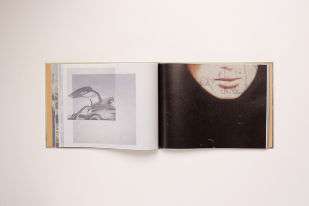
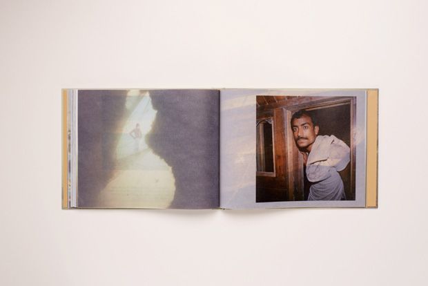
Olivia first showed me her images of Dubai pinned up on the wall of her garden shed (where she edits). My first impression was of lightness and fluidity – pale blue skies, desert sand, garments in bleached out colours flying in the wind. Although light and almost without gravity, the image selection looked complex, with lots of found materials and Olivia's own underwater pictures from her dives mixed in with stunning, bewildering portraits, the kind that I like so much in her work. The work feels really close yet from a distance.
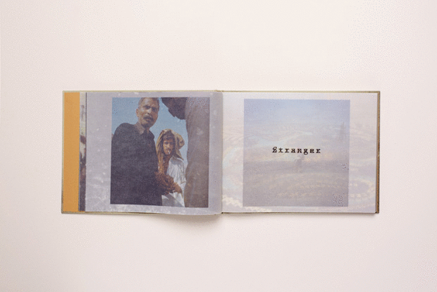
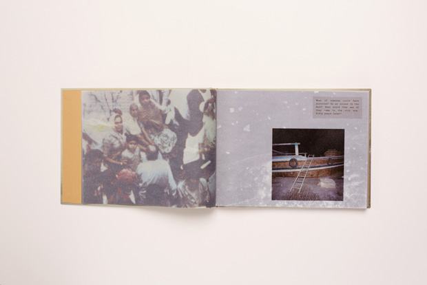
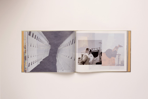
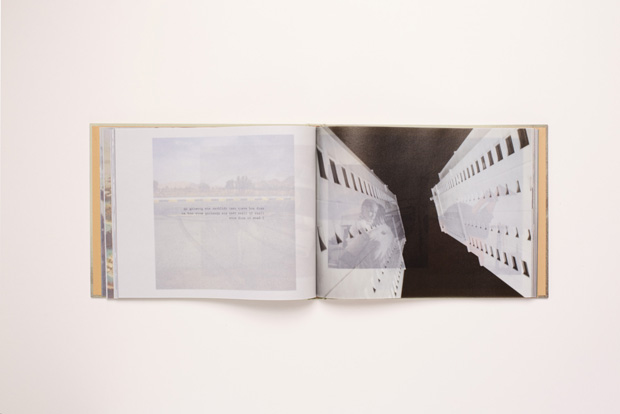
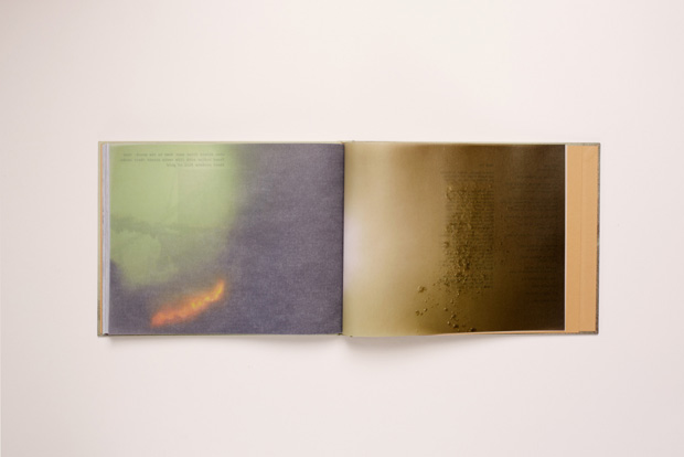
Olivia wanted conversation snippets to be mingled in amongst the images without interrupting the flow. She mentioned transparent paper. Now, I am not a big fan of tracing paper tip-ins (it must have something to do wit my obsession with it when I was a student). I showed her an alternative paper from a Japanese illustration book, that was see-through, yet was clearly paper. The entire book allowed three drawings to be seen at once. Boom. Olivia loved it: “let's do the entire book on tracing paper,” she exclaimed. Suddenly all elements that needed to live happily together in this book found a perfect home and communication vehicle. The reader would be 'floating' and 'swimming' through the pages, losing orientation, but always being intrigued by the next details that come into sight. Perfect.
The book is printed on some very special paper, could you tell us about that?
The paper is Zander's Spectral. To be honest we were hunting for that Japanese stock for ages. When we found it, we realised it would only be feasible to use it if we printed in Japan. Timing and budget restraints didn't allow this unfortunately. So we found a good substitute with the Spectral.
What were the technical challenges of using the paper?
Die Keure, the printer, did several tests for us on the paper, using different inks, varnish, drying methods etc. Nobody I spoke to has ever printed an entire book on this stock. Its base colour kept fooling us, changing its tone all the time. Is it warm, or too cold? It wasn't easy, that's for sure. But the result is great, I am really happy with it.
The design and artwork were not straightforward either. A lot of cutting and pasting into place with semi-opaque images were needed to create the correct overlap and full layering composition. Once it was roughly in place, we did almost a full day together at the screen fine-tuning.
You are very experienced at designing books for artists and photographers - what is the key to getting the balance right between your input to the designed object and allowing the work to shine through?
The key is treating every project totally individually. I love photography and when I understand the work in front of me, a great collaboration can take place. I never mimic or copy the work. The clue is in your question, the work has to shine through, or even better, the work, the intention of the artist, the thoughts that have gone into the work, the personality of the artist, all that should somehow be detectable in the book. When I get involved very early on, sometimes even during the making of the work like with many of the books I designed for Stephen Gill, this is more likely to happen.
Another important factor is, to respect one another. There are publishers and artists out there that are 'afraid' of design around art, especially photography. It's important for all involved not to be prejudiced or formulaic.
What element of this project are you most happy with and would you do anything differently?
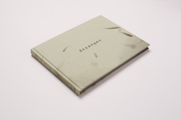
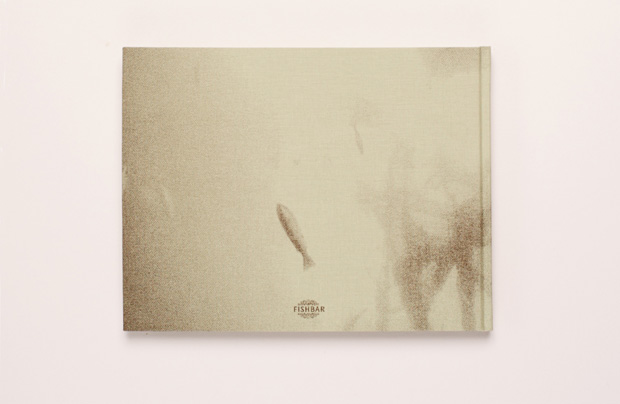
I really like everything about the book. The look, the feel, the turning of the pages. Although we spent two days and a night solidly on press we didn't get to see the cover silk screen. This is maybe the only weak point, the image on the front came out too light. But the title graphic treatment still makes my little heart jump.
Muesdesign.com
Stranger by Olivia Arthur is available from Fish Bar


