Lettersetal type foundry just launched with fully functioning Test Fonts for designers to use in pitches.

Based in London, the fonts designed by founder Matthew Burvill since 2012, are finally released with a focus on modernised, fairer, licensing that puts designers first. That means as a designer you are free to use the Test Fonts in pitches to your clients, and the licence is fairly priced based on the size of the client who must licence the fonts. You are free to pitch the fonts for use in Apps, Websites, and more, safe in the knowledge that this will not increase the cost to your client.
With 8 font families at launch there’s lots to explore. With an interactive website focusing on testing and playing with the fonts, this allows you to compare families and styles in one place. Also play with Variable Fonts such as Algam Mix whose 5 axes allow you to fine-tune letter shapes, proportions, and curvature and encourages you to find your mix by combining elements from the Algam A, B, and C sub families.
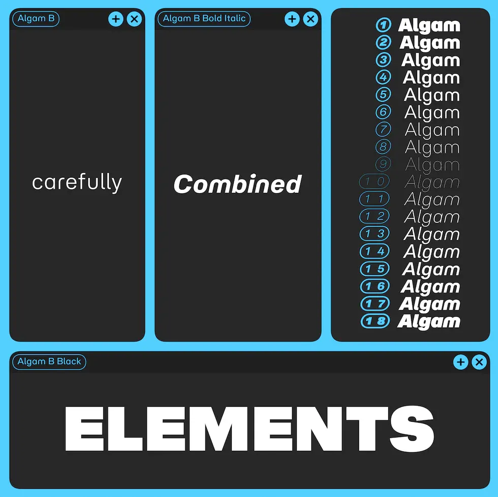
Algam A, B, C, & Mix:
The aforementioned Algam series comes in three flavours ranging on a spectrum of playfulness and utility. From Algam A whose softer curves and friendly shapes bring a playfully retro aesthetic, to Algam C whose squarer curvature, higher contrast, and traditional shapes bring a broader, stronger feel to headlines and text. Algam B, in the middle, keeps some friendly forms mixed with more traditional shapes that result in a usefully friendly tone that works for medium length text and headlines. Algam Mix allows you to take control of parameters such as Curvature and Proportion, as well as the character shapes used.

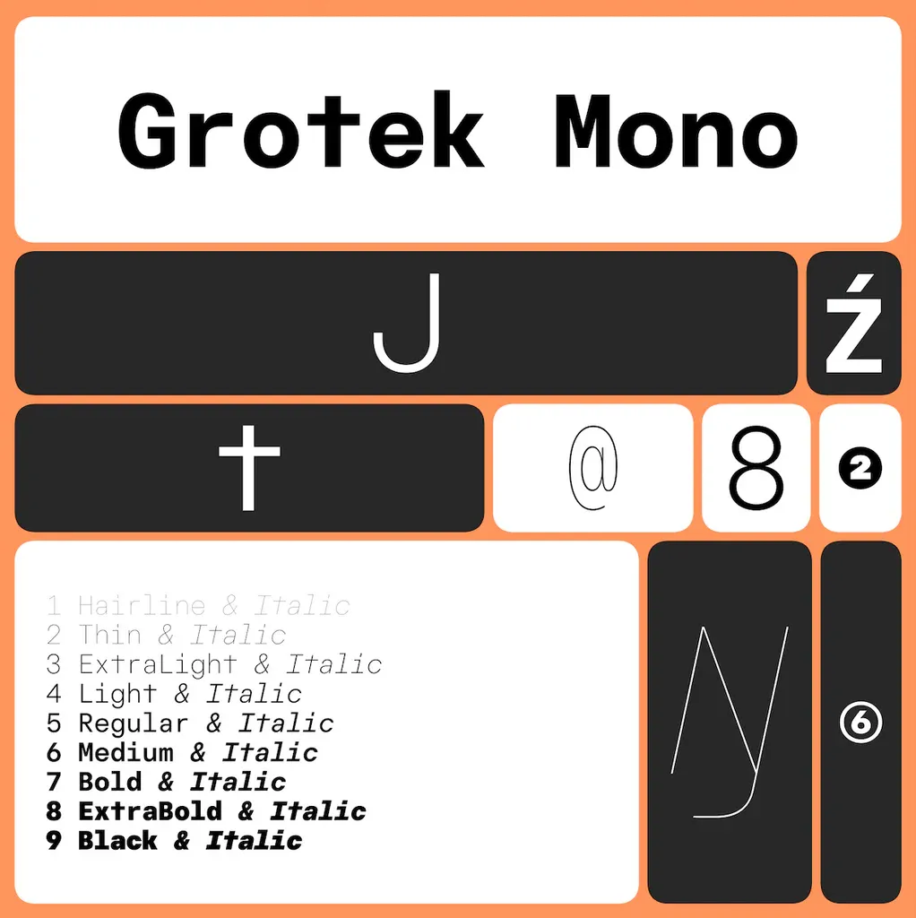
Grotek & Grotek Mono:
Pulling from ideas of Swiss Precision, Grotek and Grotek Mono are the technical grotesks that take neo-grotesk ideas and draws them with geometric precision where proportions and shapes are not dictated by strict geometry, but that same clean and crisp geometric precision is clear.

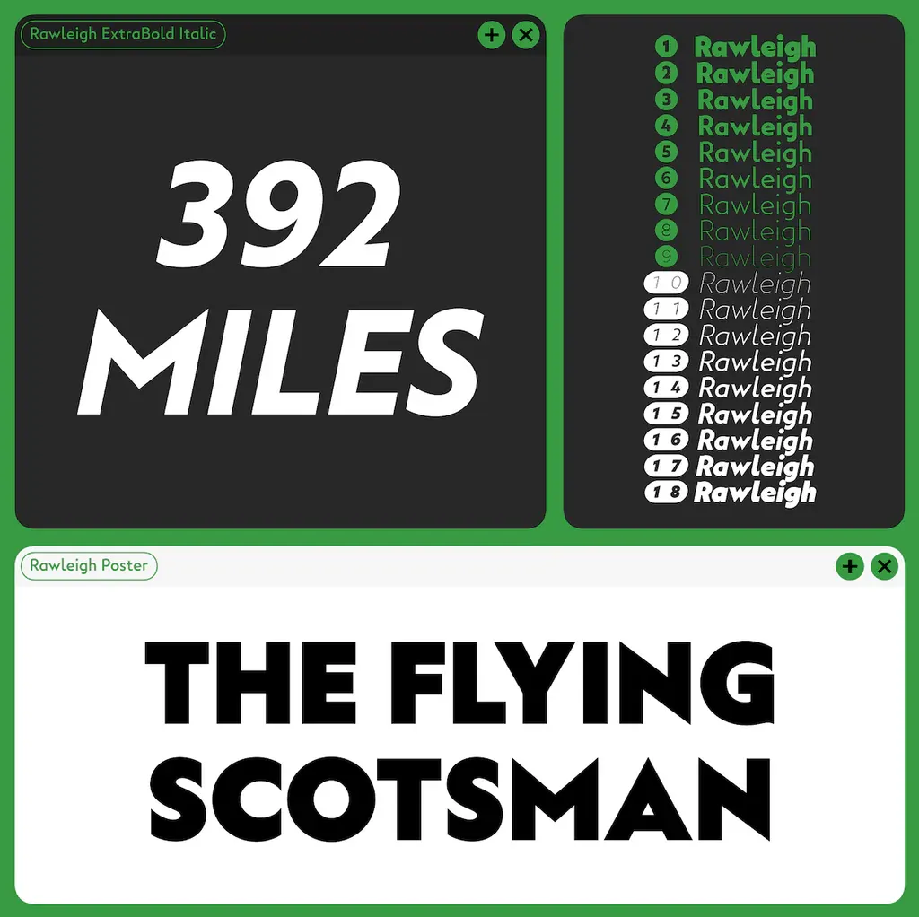
Rawleigh & Rawleigh Text:
Inspired by Britain's industrial past, Rawleigh and Rawleigh Text are humanist and geometric styles that take inspiration from 1920s and 30s railway posters. Rawleigh is a display type intended for use at big sizes, it comes in a large range of weights from Thin and Poster via the elegant Book weight. Rawleigh is characterised by its distinctive ‘flick’ on top left corners where curves meet stems such as in R, and by its sharp diagonals such as the pointy N. Rawleigh Text tames down these features and increases the x-height to aid legibility at smaller sizes. The ‘flick’ is removed and the diagonals are blunted making for a smoother reading experience that is also helped by traditional double-storey shapes for ‘a’ and ‘g’.

Come to Lettersetal.co.uk to explore the typefaces and download fully functioning test fonts to use in pitches for your next client project or reach out to plan your next custom type job.

