As the Hans Brinker Budget Hotel unveils the latest in a run of controversial advertising campaigns, we get an exclusive inside view of the ongoing relationship between Erik Kessels and Anthony Burrill.
This week has seen the launch of a new advertising campaign by KesselsKramer for the Hans Brinker Budget Hotel in Amsterdam, featuring artwork by Anthony Burrill. It’s the third collaboration between the Dutch advertising agency, the Amsterdam-based hostel and the British illustrator, in a relationship that has spanned over twenty years. In that time, KesselsKramer has gone from being a leftfield upstart to an advertising industry game-changer; Burrill has achieved big-name status as a graphic artist; and the Hans Brinker has become the little hostel with a brand identity of outsized proportions. Apart from courting admiration and controversy in equal measure in the press, the ongoing KesselsKramer’s campaign has succeeded on a business level for the Hans Brinker, tripling room bookings and making it a stalwart of the budget travel game.

It may all look a bit unexpected in the annals of advertising history — a budget hotel with a name and a publicity campaign that outstrips its otherwise modest place in the world. But there is a powerful trio of personalities at the heart of the twenty-year relationship, which has shaped its success, and a shared sense of fascination with the ‘ordinary’ and love of honesty that has made Hans Brinker famous for being “the worst hotel in the world”.
“It's incredibly important [to me]. Whenever I talk about my work, I always show the Hans Brinker campaigns.” says Burrill. “Because of the attitude of it and the way that it spoke really honestly, it's kind of anti-advertising, but was incredibly successful in what it achieved, turning the Hans Brinker into a sort of cult hotel.”
That cult status is something that’s also associated with KesselsKramer — the agency, founded by Erik Kessels and Johan Kramer in 1996, quickly re-wrote the advertising rule book, dispensing with slick conventions, daring to ask the questions no right-minded advertising creative would dare, and execute campaigns that challenged every notion of what advertising should, and could, be. The Hans Brinker is perhaps the most eloquent example of KesselsKramer’s wilful rejection of the rules. Whoever would have thought a hotel could sell itself on its short-comings? “Now Even More Noise”, “More Rooms Without a Window”, “Even More Dog Shit in the Main Entrance”, run its unforgettable slogans. Let's be honest, ninety-five percent of advertising is terrible. For me, that's a call to try to change something. The hotel industry ranks as pretty traditional in its approach to marketing, especially so in the mid Nineties, making KesselsKramer’s achievements with Hans Brinker all the more remarkable. It reflects the way the agency set about disrupting the world of advertising. “Let's be honest,” Kessels says, “ninety-five percent of advertising is terrible. For me, that's a nice call to try to change something. When everybody is going in one direction its quite nice to go in the other direction. You can't do that with every client, but you can with some clients, like Hans Brinker. Visually, every hotel would like a nice brochure with pictures that lie a little bit and show it a little bit better than it is. That's the hotel business. Not so much now, but it was a very traditional category. It’s the same with fashion, or when you see advertising for sunglasses — it’s just a close up of a model wearing sunglasses and a logo underneath.”
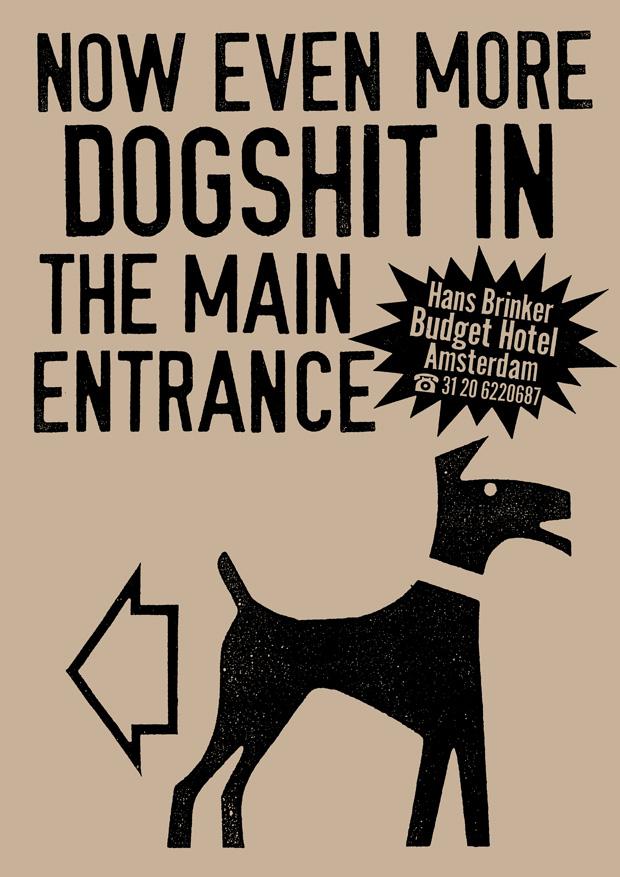
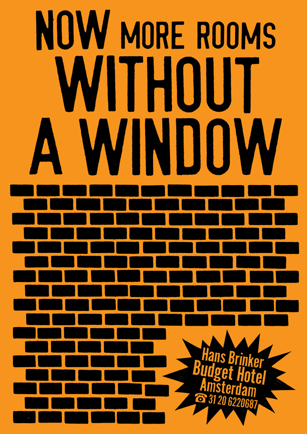
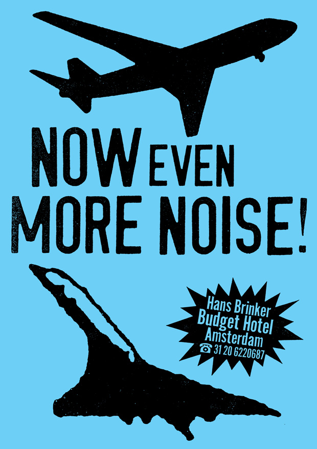
It takes a client with trust, and some balls, then, to hire an art director like Erik Kessels. Kessels himself would prefer to see it in terms of human relationships — you and your client have to get to know each other, “drink beer and talk about other things”, to really understand each other’s motivations and requirements. Kramer got to know Rob Penris, who founded the hostel in 1970 and managed it until he passed away two years ago, while he was an art director at Ogilvy & Mather. Penris was one of his first clients when he opened KesselsKramer and the two had a very close and creative relationship. “He was, of course, a driving force behind it,” Kessels says of Penris’s input to the advertising campaigns. “We had lots of discussions on which way it should go. When you have two people that enjoy working together and try to take it further and get it to make even more sense, or disrupt it again, that relationship can be something we could almost write a book about.”
Indeed, it did produce a book — The Worst Hotel in The World, published by Booth Clibborn, 2009. When it came to launching the book, Penris took delight in proposing the venue of The Ritz in Paris for the celebration. “Rob said there’s a relationship between the Hans Brinker budget hotel and the Ritz,” Kessels recalls, “because when you type it in to search engines you often also see The Ritz mentioned — people say ‘don't expect The Ritz’ or ‘it's not The Ritz’. So he rented The Ritz tearoom for an afternoon, invited the press and handed over the first copy of the book to the manager of The Ritz. It's nice when people dare to play with things and have those ideas”.



That meeting of minds took on a third dimension when Kessels brought a then-unknown Anthony Burrill in to the fray to create artwork for the first Hans Brinker poster and print campaign. “It was almost like Anthony kicked the ball in,” says Kessels. “The ball was on the line and we needed somebody to score the goal and kick it in.” Burrill did just that, bringing his pared-back typographic approach and appreciation for self-deprecating humour to the mix. It was a winning formula that KesselsKramer returned to after the initial 1996 campaign for a further outing in 2004 and the most recent series, released this week.
“Thinking about those three campaigns from three different decades,” says Burrill, “it’s like they are cultural barometers. Without wanting to make it into too big a deal, they almost represent the nineties, the noughties and whatever this decade now is called. The first one was very raw and anti-advertising. I don't think that campaign could have happened in the eighties, it was of it's time, when irony was the main flavour. The middle one was more about the whole idea of the trend for designer boutique hotels, it was at a time when Erik had gone on to do work for actual proper hotels. The third one is about Hans Brinker wanting to be the most likeable hotel in the world, engaging with social media”.
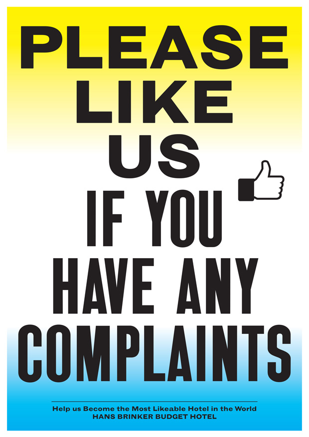
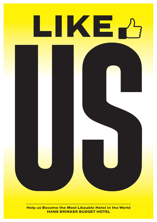
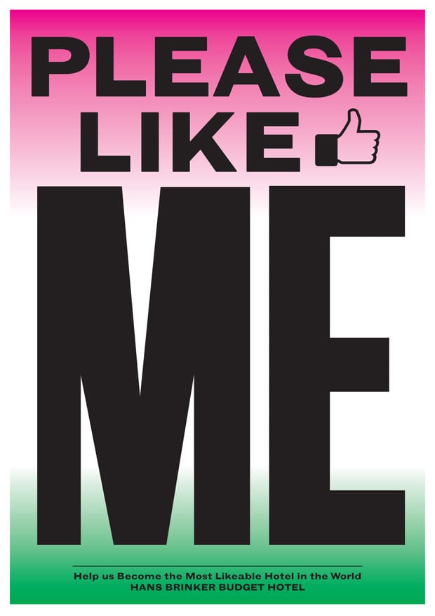
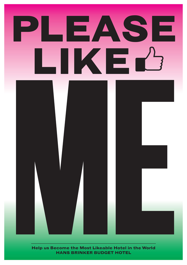
The latest campaign stays true to the running theme of Hans Brinker revelling in its own failings, gladly getting it a bit wrong and not caring. It revolves around the idea of being ‘liked’ on social media — “Like Us Before We Like You.” “There’s a little bit of a threat in there,” says Kessels, “something wrong”. Burrill adds that his own relationship with social media meant the campaign’s message chimed with him, as it will for many other users of Facebook, Instagram and Twitter. “Wanting to be liked. I can identify with it,” he says.
Visually, the new posters are a departure, in the same way that the second campaign had moved on from the first. The graphic style is inspired by Burrill’s work with the Colby poster printing co. in LA, founded in 1946 but now sadly closed, it was the purveyor of a very distinct style of eye-popping letterpress and screen printed posters that were a common sight on the street of LA in its heyday. “Colby has closed now,” says Burrill, “so that's an aesthetic that's kind of over. But it felt like the right way to treat [Hans Brinker]. It kind of looks hopeful, but sad at the same time. It's asking you to like it. It's put on it's best make-up, that's the tragic scene. It's the oldest swinger in town”. Anthonyburril.com
Kesselskramer.com

