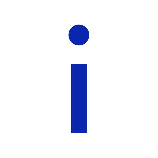
Graphic designer Paul Finn investigates the personal attributes of Futura’s lowercase ‘i’ from all angles.
The future was bold in 1927, as Paul Renner typographically manifested Modernity. Reduced to geometric perfection, his timeless Futura gave form to the principles of the modern movement. A universal sans-serif which transcended time and space, bringing to fruition the earlier typographic experiments of Bayer and Tschichold.
I align to Futura Bold’s lower case ‘i’ whose form is attained by a near perfect circle suspended harmoniously above its opposite geometric form, an elongated square. The only letterform to be formed by these binary opposites of the dot and the line, suitably illustrating Paul Klee’s maxim that “a line is a dot that went for a walk”.
Not just a letterform, ‘I’ is also a word: a pronoun, the first person singular, used by a speaker to refer to himself or herself; and also a noun, the ‘I’ in metaphysics is the subject or object of self-consciousness; the ego. The lower case ‘i’ seems a more fitting form of the self, in comparison to it’s sibling the consolidated capital ‘I’. i is now re-framed as an icon of the self; a head and a body. A symbol of the human figure, standing solid and proud.
i also admire i for its versatility of form and meaning: rotate i 90 degrees and it transforms into — • the Morse code for the letter ‘n’. Rotated 180 degrees, it morphs to exclaim the glyph !. Rotated 270 degrees it translates to • — the Morse code for the letter ‘a’.
i –• •– !
Reduced to further abstraction i see i re-framed as Edward Munch depicted the moon’s reflection in the sea in his 1895 painting ‘Moonlight’, in which the moon’s reflection forms a vertical line. The space between the dot and the line now infers the horizon, a place of translation from a dot to a line.
fitzroyandfinn.co.uk
March 20, 2014 1 minute read
Vowel Control
Graphic designer Paul Finn investigates his personal attributes of Futura’s lowercase ‘i’ from all angles

