
In today's Archive piece, Pentagram partner Marina Willer looks at a larger-than-life logo designed over a hundred years ago which (despite recent attempts to slim him down), is still recognised the world-over.
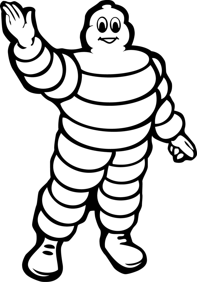
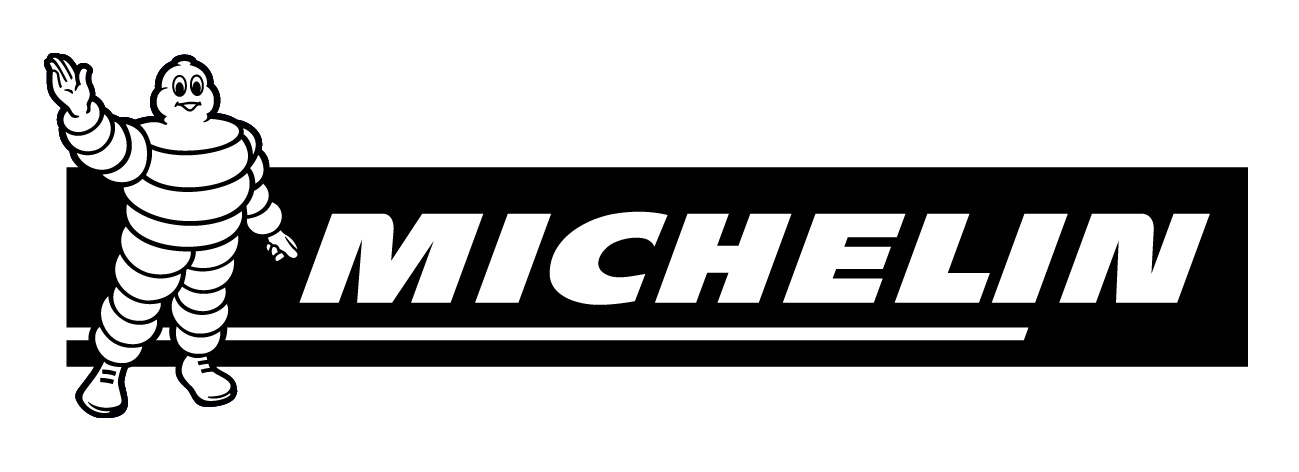
The Michelin Man, designed by cartoonist Maurice Rossillon in 1898, is a remarkable example of graphic design remaining relevant and powerful in an ever-changing world.
I love him because he totally contradicts current thinking on how a logo (or symbol for a company) should express the core values of that organisation. Imagine the clichés that a world-leading tyre company such as Michelin would expect to be associated with – solid, reliable, masculine, etc – all expressed through a functional design that conveys stature.
Instead the Michelin Man is romantic, silly, childish, naïve and reminiscent of an era when we believed that mascots were a good way to engage with the public and become memorable. We love him because he’s got personality, he’s human and imperfect, he’s optimistic and most of all not corporate in a cold responsible way.
The logo also contradicts the idea that design is bad when it’s literal. The curves in our hero’s shape come from piling up tyres. That could not be more literal (even though in an absurd way) and yet they are wonderful.
The original design of the Michelin Man is the best of graphic design because it’s not affected by trends and fashion. The style is timeless – I think Michelin’s attempt to modernise (and slim down) our cuddly friend is a crime. I also love the naïve belief that a marque is all you need to communicate the spirit of a company.
Nowadays you couldn’t get away with something like that because brand identities have to create a complete and coherent story, of which the logo is only the starting point. But if that is true, how come the Michelin Man survives in such a triumphant way?
This piece first appeared in Grafik 166, September 2008.


