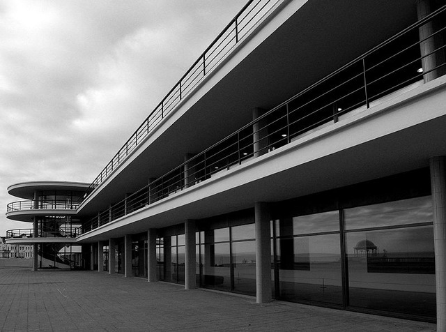
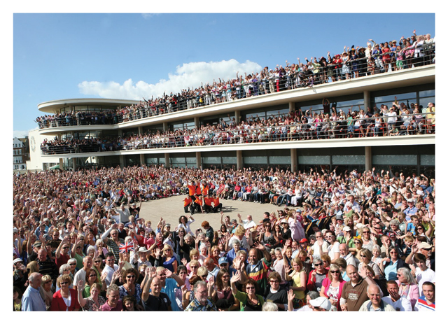
Erich Mendelsohn and Serge Chermayeff's majestic De La Warr Pavilion in Bexhill is 80 this weekend, and it's celebrating with a brand new identity, expertly created by Playne Design and Jim Northover.

The opportunity to rebrand a leading cultural institution doesn't come up that often, especially not one that's located right on your doorstep. We caught up with Clare Playne of Playne Design, and designer and brand strategist Jim Northover to get the lowdown on their sophisticated new identity for the iconic Modernist building, Bexhill's De La Warr Pavilion.
How did your partnership come about, is this the first project that you’ve worked on together?
CP
: I was introduced to Jim via Freda Sack, former president of the International Society of Typographic Designers (ISTD) while scoping and managing the 2014 ISTD Professional Awards. Both Jim and I live locally to Hastings and since our first meeting have made a wonderful connection. However, I must now fully confess I have always been a great fan and have followed Jim through Lloyd Northover, not only during my studies in the early 90s but throughout my professional career.
JN: We met up at the ISTD judging last year, which was held at the De La Warr Pavilion, and kept in touch. Clare asked me to provide some consultancy for her studio and, when the project came up, asked if I’d get involved. No hesitation. It’s the first full-scale branding project we’ve done together. Hopefully, not the last.
How did the relationship with the De La Warr come about?
CP
: When my husband and I relocated to Hastings one of our closest friends (John Reynolds) introduced us to this wonderful building. Of course, I had read about DLWP but visiting it was altogether a very different story. Since that day, every year, sometimes twice (we wanted to stay cool) we would drop the communications team a subtle mailer to say ‘hello’. Six years later… it was in fact their part-time designer Ade Mills who approached Playne for some work; an incredibly, enthusiastic individual whom we simply could not turn away. Through this connection we started conversations about hosting the ISTD Professional Awards judging weekend and three months later this progressed to hosting the Awards ceremony where we had winners visiting from across the globe – it was the most celebratory evening. After this initial connection I was invited to sit in on some internal workshops / discussions at DLWP. This is where – most unexpectedly – the brief for a rebrand started to emerge…
JN: A few years back I’d done some background research on the De La Warr for my Masters in design writing, so I knew a bit about the building and its heritage. After all, it is probably the most significant Modernist public building in the country. I was also aware of its exhibition programme, often touching on artists with a graphic sensibility.
What was the original brief and did it change at all throughout the duration of the project?
CP
: The foundation of the brief came from a workshop some 18 months ago and more recent sessions – there was a united consensus that the identity needed to reflect the origins, grass roots and heritage of the building, while we had the added challenge that the identity needed to perform coherently across an ever-extending range of platforms and channels.
JN
: The brief remained pretty clear throughout. We needed to solve some practical problems, help re-connect with the Pavilion’s roots, be sensitive to the architecture and what it stands for, and be aware of the diverse programme and audience base. Those fundamentals didn’t shift.
What are the particular challenges involved in working for a cultural institution and all its attached stakeholders?
CP
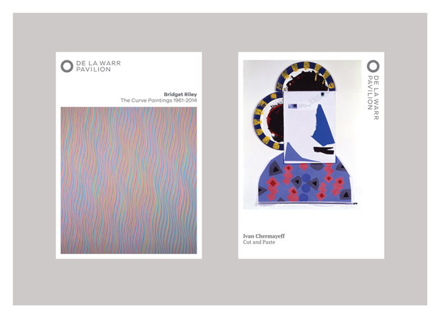
: A particular challenge was a very important component of the brief for me – ensuring that the diverse senior management group and their teams were listened to – we needed to create a brand that was true to DLWP, and had meaning for their staff and the roots of the place. All the staff are heavily involved and committed to the process and future of the brand. We should not forget that DLWP does not own its own collection and the exhibition trail in recent years has spanned iconic names from Andy Warhol to Ivan Chermayeff, Joseph Beuys to Bridget Riley, Ladybird books to Cy Twombly. The exhibition range is engaging and diverse. Live shows span from Waterboys, Clean Bandit through to Elvis Costello.
JN: Like most cultural organisations, it is made up of a team of independent minds with specialised responsibilities. Fortunately it has good leadership too. Quite rightly, the team is more sensitive to aesthetic issues than many clients. It’s important that the brand didn’t detract from the architecture or the programme of events and exhibitions. It needed a light touch. There’s been much debate about how cultural institutions should be branded, if at all. Like any organisation, they need to stay relevant to their audiences and communicate with a coherent voice. Most of all they need to be true to their own individual purpose and vision. The great thing about the DLWP team is that they intuitively recognised this.
What was the inspiration behind the design? Did the design go through a number of iterations before you settled on the final route?
CP
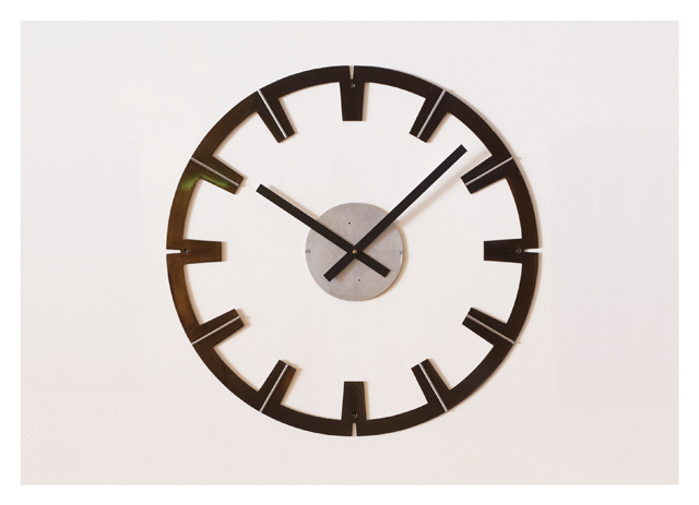
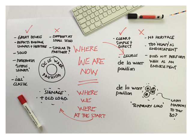
: The true inspiration came from the staff and leadership – their passion, knowledge and sheer love for the building. We anticipated a stepping stone level of development; their former brand produced ten years ago had performed well and became the springboard for many new ideas. However, we needed to adopt a new identity protecting the integrity of the early years while looking ahead towards the next 80 years – creating a brand that connected with an incredibly diverse audience, from the local skateboarders to the critically engaged. We did a lot of scoping; numerous questions were asked. Within the studio we created many variants upon a theme but showed one final solution, in which we were confident. Ultimately, the building and Ivan Chermayeff’s 80th logo were instrumental in the end result – it tells a story.
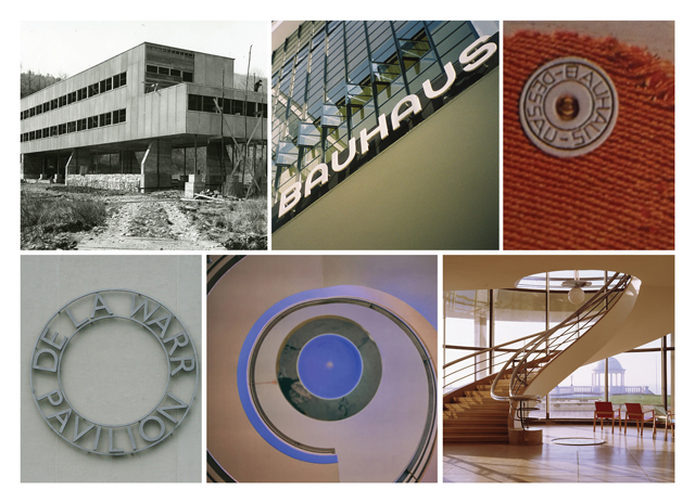
JN: Like Clare, I was expecting a more modest change, but our audit and research led us to the need for more visual focus, and typography and colours more in line with 1930s Modernism, rather than being just vaguely ‘modern’. Looking back to the Bauhaus, and how it translated across to the UK and on to America was helpful to our thinking. Continental Modernism was pretty radical and it became something a little different when it hit our shores. I think the building of the De La Warr represented another kind of continental invasion close to Hastings some 800 years after the Normans.
The building is very much part of DLWP’s identity – how did you incorporate that, and did it prove at all problematic?
CP
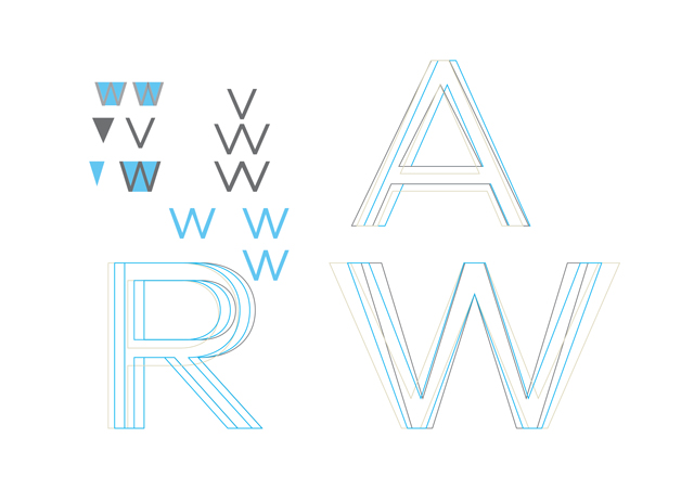
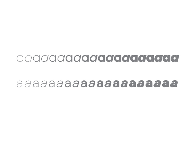
: The building expresses it geometry - there are circles everywhere. We felt DLWP needed to take more ownership of that distinctively Modernist geometry, something that has been truly theirs since 1935 – the first Modernist, pioneering public building of its time. (Do watch the anniversary film made by a DLWP staff member, James Cosens). The typography came from the true Grotesque inspirations of its time. We selected a typeface that could perform across all media and, after a lot of research, we found a Grotesque that we felt not only built on their previous brand, but also allowed a move forward without restrictions. The typeface is Galano.
JN: The building was the primary influence all along. We needed something that allowed the architecture and space to speak, not a graphic interpretation of it. Picking out an aspect that was quintessential, not invented, that was the key, echoing both the lightness and the boldness of the building. It’s quite a responsible task – we felt the weight of history.


Which aspects of the project are you most pleased with?
CP
: Firstly, what may appear a simple solution was in reality quite a problem to solve. Now I really love it when we hear people say, ‘Umm, that’s really simple.’ Secondly, I love how the process and the collaboration brought together Playne, Jim, the team at DLWP, plus the unity of the name and roundel.
JN: I like the way Playne Design has achieved a balance of light and dark in the roundel and logo. I’m also pleased they adopted our line “Est. 1935. Modern ever since.” It makes a point only they can.
What’s been the initial reaction from staff and visitors?
CP
: We had scheduled a slow roll out but a testament to its success is that all of the staff are all keen to adopt the brand ‘now’ – this is hard work but it’s great – we could not have asked for a better response.
JN: So far, so good. Enthusiasm is always the best first reaction from those who have to work with it. Ultimately, we need to maintain coherence and make sure it does a good job in every situation. We’ve yet to hear more from visitors. My guess is that they will feel ‘like it’s always been there’. And that’s exactly what we want.

There seems to a blossoming design community in Hastings, as a designer is it a good place to relocate to?
CP
: I love Hastings, it’s raw and fresh, reminds me very much of when I first moved to London in the early 90s. I like the fact it has ragged edges; I like the fact it has real issues; I admire the passion of the local people to look after and cherish their town. I enjoy the political battle in the papers – one minute it’s classed as being Shoreditch on Sea; the next it’s Costa del Dole. I have to say it feels as if there are more creatives in Hastings than in central London right now. There’s never a lonely moment; friends and associates span from filmmakers, musicians, illustrators, animators, game makers, jewellery makers, photographers, potters and screen printers to typographers and textile artists. The list goes on and on. Hastings is like a Tardis – small, yet packed full of fantastic inspirational people… or perhaps it’s like a really well-filled sandwich; sometimes the packaging could do with being neater but the parts that matter most are all fine and good.
JN: I have lived not that far from Hastings for over thirty years. It’s changed a lot and it’s following Brighton in that respect. Given its recent history though, it will probably continue to feel ‘edgy’ for some time, and that’s no bad thing for a creative place.
playnedesign.co.uk
jimnorthover.com
Join the De La Warr for a fun-packed day of 1930s-themed celebration on Saturday 12 December 2015 – the free event features live music, dancing, film, Punch and Judy, classic bikes and cars, fireworks and special guest and DLWP patron Eddie Izzard. More info here.


