
Humorous, bold and bursting with energy, the covers of late 70s magazine WET perfectly sum up the surge in creativity of the New Wave era, argues illustrator Sarah Tanat-Jones.
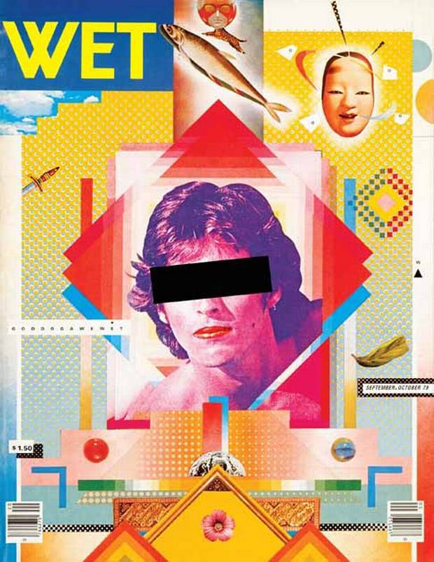
A magazine that only ran to thirty-four issues and ostensibly focused on the subject of 'gourmet bathing', WET is a magazine whose covers I treasure. They feature bold blocks of colour, great use of typography, inventive cut'n'paste and collage techniques, and a wonderful New Wave and Postmodern graphic style.
This is my favourite era of graphic design and it's come around again. As an illustrator, I see its influence now, everywhere. Boldness and humour is back in illustration, and we also have the luxury of using digital methods to replicate printing techniques.
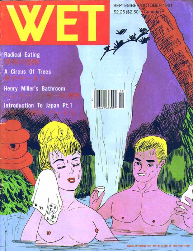
A perfectly realised flash in the pan, WET – like the 20s deco swimming craze – honed in on the idea of the body beautiful, that post-Studio 54, pre-Jane Fonda moment, the coming together of lifestyle, music, graphics and ideas. It covered music and celebrity in the same way many current magazines do, and was damn good looking while it did so.
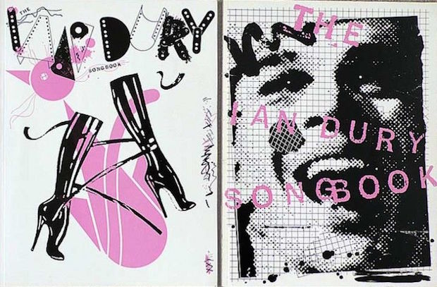
Another favourite designer of mine, the inimitable Barney Bubbles, made this era his own. His magazine and album covers (like his designs for 1979's The Ian Dury Song Book, pictured below) have become icons of the New Wave. Like punk's cooler, university student older brother, this work keeps all the energy and primary colour, but adds something a bit more refined to the equation.
I love this work. It lasted a few short years in the late 70s and early 80s, sandwiched between two outlandish eras in fashion and music. The aesthetic was mirrored in the musical intelligence of bands like Wire, The Durutti Column and Joy Division, bringing style and thoughtfulness to their work, instead of aiming to please the charts. It's also the last few years of analogue, and a brief window of time when activism became a lifestyle for many, and gentrification was a distant speck on the horizon.
The notion of beautifully made magazines designed for a smart niche audience is in rude health right now – I think of Kinfolk, 032c, Oak, The Gourmand... (I spent ages in Magazine, in the North Laine in Brighton, to help with this research – there's a smorgasbord in there). Despite the Internet being a portal into any digital imagery you might care to search for, there's something lovely about a large format, crisp magazine, so big that you have to nestle it in your knees. The smell of good quality paper has a vague fragrance of pine sap, the colour saturated photography you can almost dive straight into.
Diving straight into a copy of WET is something I'd love to do. I just need to find an actual copy somewhere, and I'll dig out my bathing suit.
sarahtanatjones.com
Sarah Tanat-Jones
…is a London-based illustrator whose clients include Asos, The Guardian, The National Trust Scotland and Lufthansa. Represented by Handsome Frank, Tanat-Jones often works with bold inks and bright colour palettes. She is also the co-founder of record label Kit Records and makes music as a sequin-obsessed alter-ego called Synaesthete.
WET
Published from 1976 to 1981, WET started as a one-man operation run by artist Leonard Koren. The name came from his art practice at the time – dubbed ‘bath art’ – and help crystallise an aesthetic emerging in Los Angeles in parallel to punk. The magazine led the way in stylised fashion photography, made household names of musician Laurie Anderson and director David Lynch, and even featured artwork by Simpsons creator Matt Groening.