
London-based publisher Visual Editions prove that, three years on, they still know exactly what direction they are headed. There are many ways to measure success in contemporary publishing, but one of the most difficult to foster is anticipation. It requires the combination of two opposing characteristics — risk and consistency — and few are better at marshalling them than the London-based avant-garde publisher Visual Editions. Since appearing in the winter of 2010, each one of their infrequent but perfectly conceived and highly differentiated projects has only served to increase the anticipation for where (and with who) they might next shift the horizon of experimental publishing. Visual Editions metes out work that astonishes when compared to the miscellany of mass-market paperbacks... As its name suggests and its strap-line, “Great Looking Stories”, confirms, Visual Editions commission literary texts in which the design and the writing are considered equals from the moment of conception. Their first offering, in 2010, was an apt re-edition of Laurence Sterne’s The Life and Opinions of Tristram Shandy, Gentlemen (originally published in 1759). Sterne’s text, with its liberal and extensive quotation and visual ticks, preempted many modernist and postmodernist tropes by a couple of hundred years; Visual Editions handed the book over to A Practice for Everyday Life to amplify Sterne’s ludic sensibilities and the resultant object, incandescently inked, soon found an admiring audience as well as a place at at the Designs of the Year show at London’s Design Museum. The following year saw two further re-imaginings, both exercises in ergodic literature: Marc Saporta’s 1960 unbound novel Composition No 1, this time with accompanying iPad app to facilitate digital shuffling, and Jonathan Safran Foer’s die-cut extravaganza Tree of Codes, a literal excavation of the author’s favorite book, The Street of Crocodiles by Bruno Schulz. 2012 brought the the publisher’s first original commission, allowing feted British author Adam Thirwell to explore his passion for digression in a published context that could, with the aid of Studio Frith, take visual as well as literary advantage of that core concept. Another Design Award nomination followed, and a growing fan base waits eagerly as, one or two projects at a time, Visual Editions metes out work that astonishes when compared to the miscellany of mass-market paperbacks with which the wider industry tries to tempt the public.
Visual Editions’ output is small. This is because books made with such high levels of detail in conception and production take an inordinate amount of energy. It is also because the company is primarily composed of just two people, founders Anna Gerber and Britt Iversen. They have no doubt been as impatient as their waiting readers of late — the complexity of printing their latest publication, Where You Are, delayed delivery of the finished object by several weeks. When I visited the studio, less than a month from launch, they still only had a partial mock-up that they’d been using for publicity photographs. One of one; handle with care.
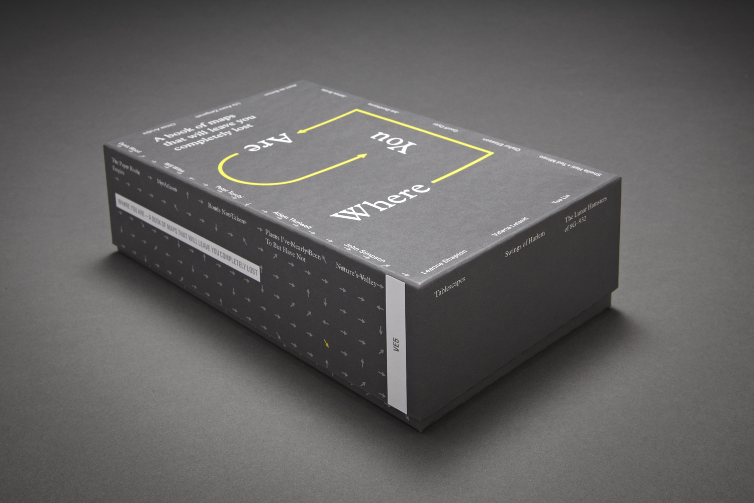
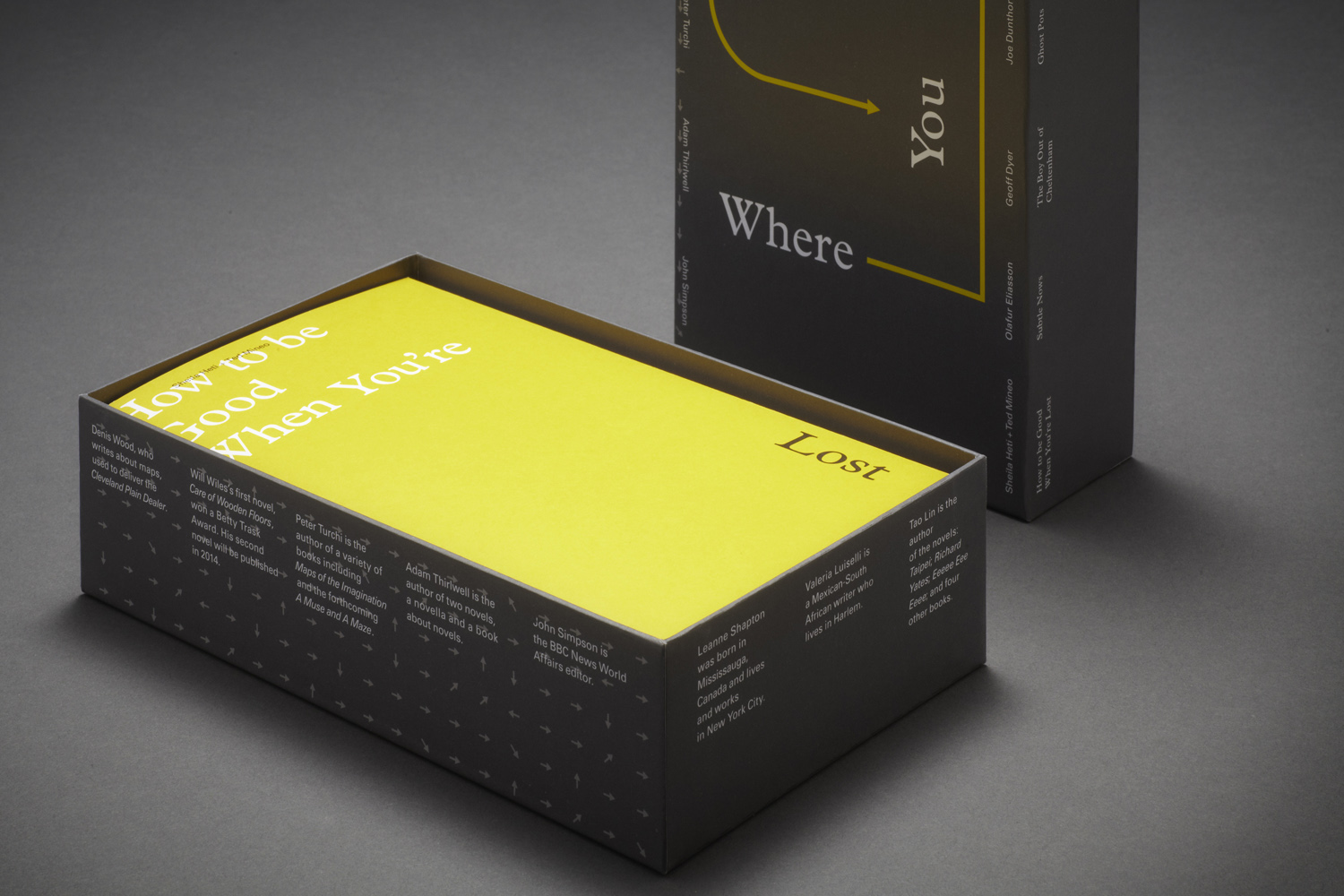
To handle Where You Are with care is no easy job. It is a very hands-on object. It takes the form of a deep archive box containing sixteen maps which expand across a range of formal possibilities, from elaborate gate-folded galleries, chapbooks and concertinas to the accordion folded, continuous layout versions with which we are most familiar. Each is the product of a different writer or artist. Gerber explains the origins of the project: “We started thinking about how maps and our relationship to maps are changing. Fold-out maps that get you from A-to-B have changed to something that is on your phone. We now use a variety of different ways to record our daily activates, through mediums such as Facebook and Twitter, through Instagram, and that’s a different kind of mapping again.” This interest in the paradigmatic and semantic shifts in mapping — around locating yourself within all sorts of linked social, emotional and physical contexts — formed the nucleus of the brief with which they approached potential collaborators: how do you map your lives - what would your personal map be?
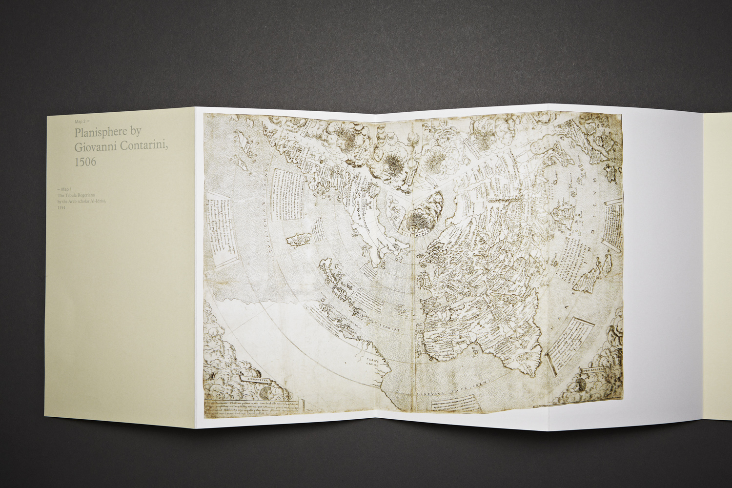
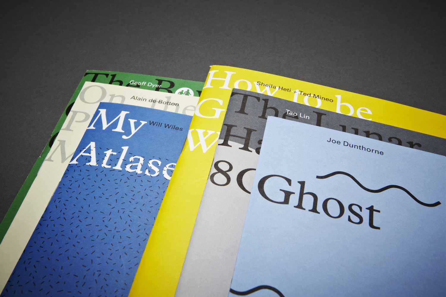
What sets Where You Are apart from previous of Visual Editions titles is that it is their first collected work. From initial discussions, sixteen candidates from a variety of fields were invited to contribute: the philosopher Alain de Botton is stationed alongside the artist Leanne Shapton; the veteran news reporter John Simpson coexists with novelist and essayist Geoff Dyer. The difficulty, and the publication’s success, is in creating an estimable whole from these divergent voices, their composition yet another kind of cross-cultural mapping, providing what Gerber describes as a “rich texture” that exists both between and within each piece.
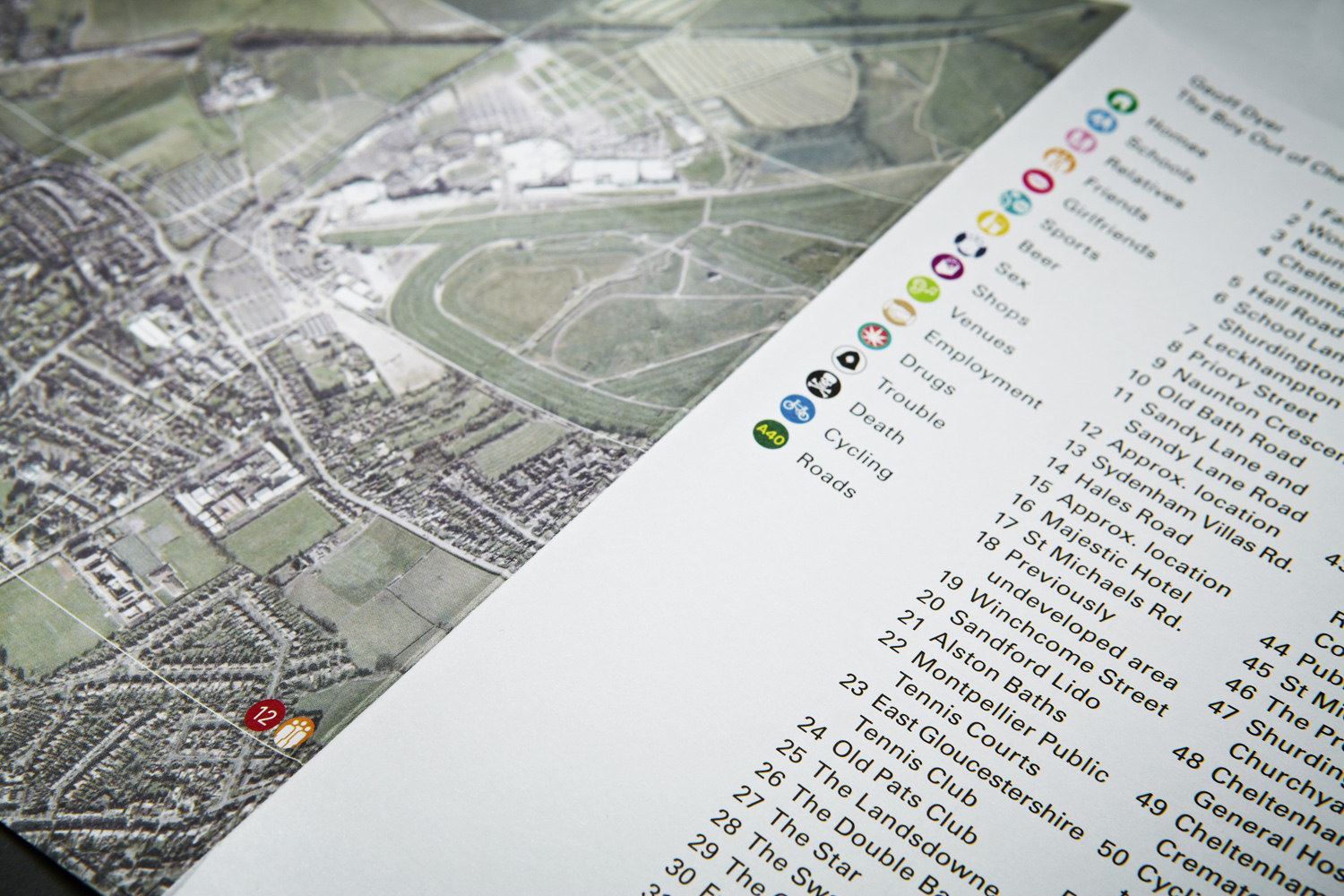
And how did those selected respond? Some, like writer and technologist James Bridle, were pragmatists, side-stepping the brief’s solipsism to concentrate on the superstructures that provoked it – in this case the purview of the Global Positioning System. Others take a historical approach, such as de Botton in his hasty essay on how the medium, either through ignorance or agenda, often bears an inherent fallibility. The most captivating, however, are those who have looked inwards before looking outwards. Novelist Will Wiles’ piece on the atlases that enthralled him as a child is a bildungsroman told through cartographic analysis. Dyer also returns to his childhood, this time overlaying a map of his hometown of Cheltenham with a highly personal narrative, encyclopaedic entries under headings such as Homes, Friends, Beer and Sex. The catharsis: palpable; the temptation to plot your own adolescence across the relevant market/seaside/commuter town: strong.
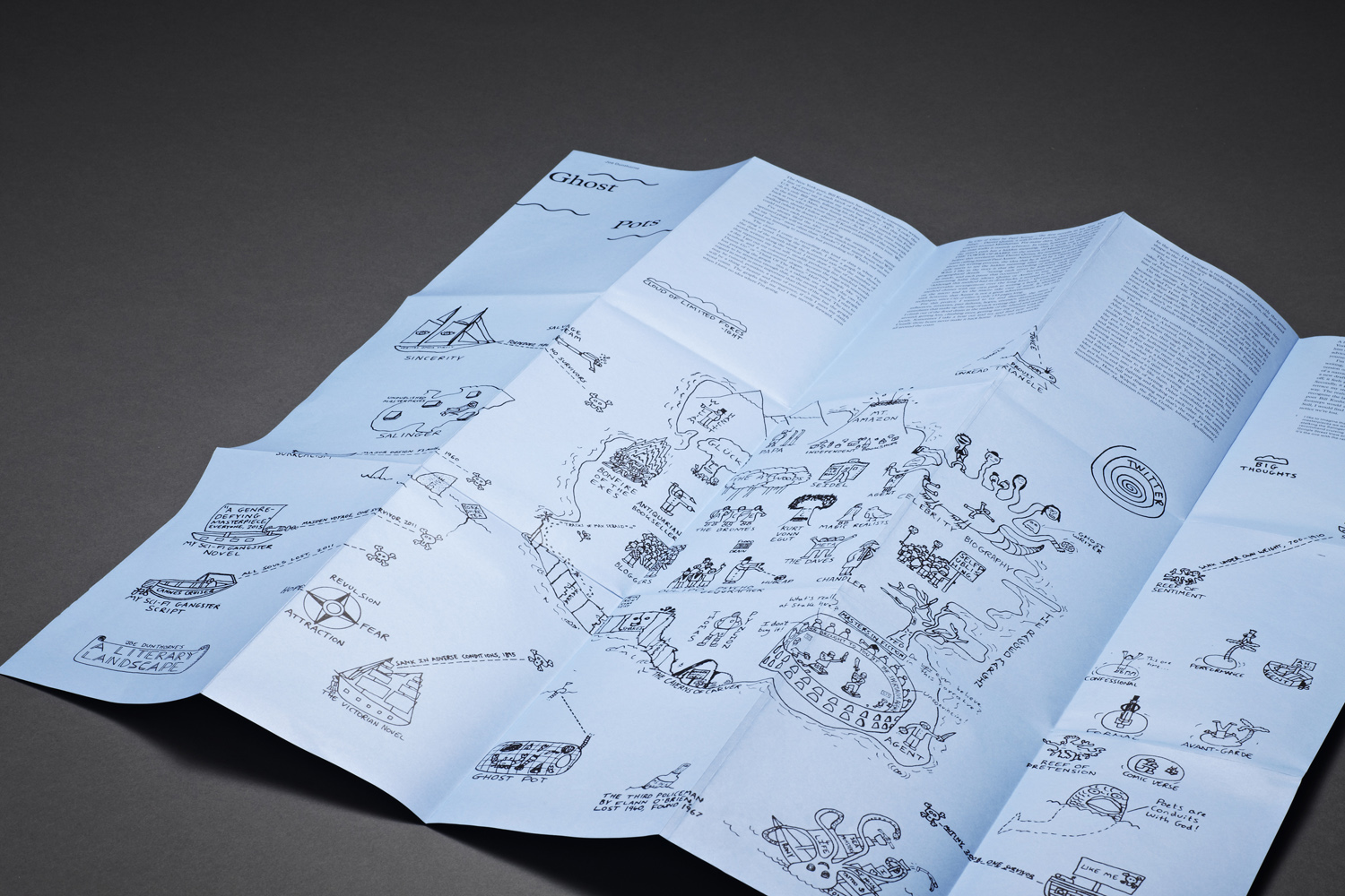
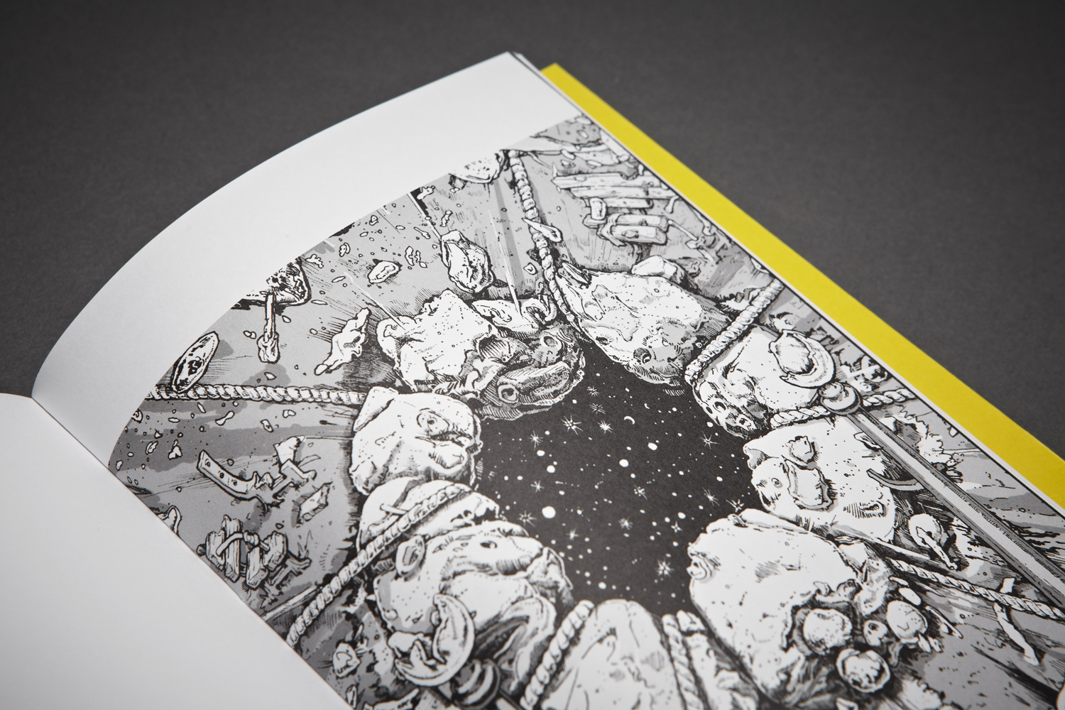
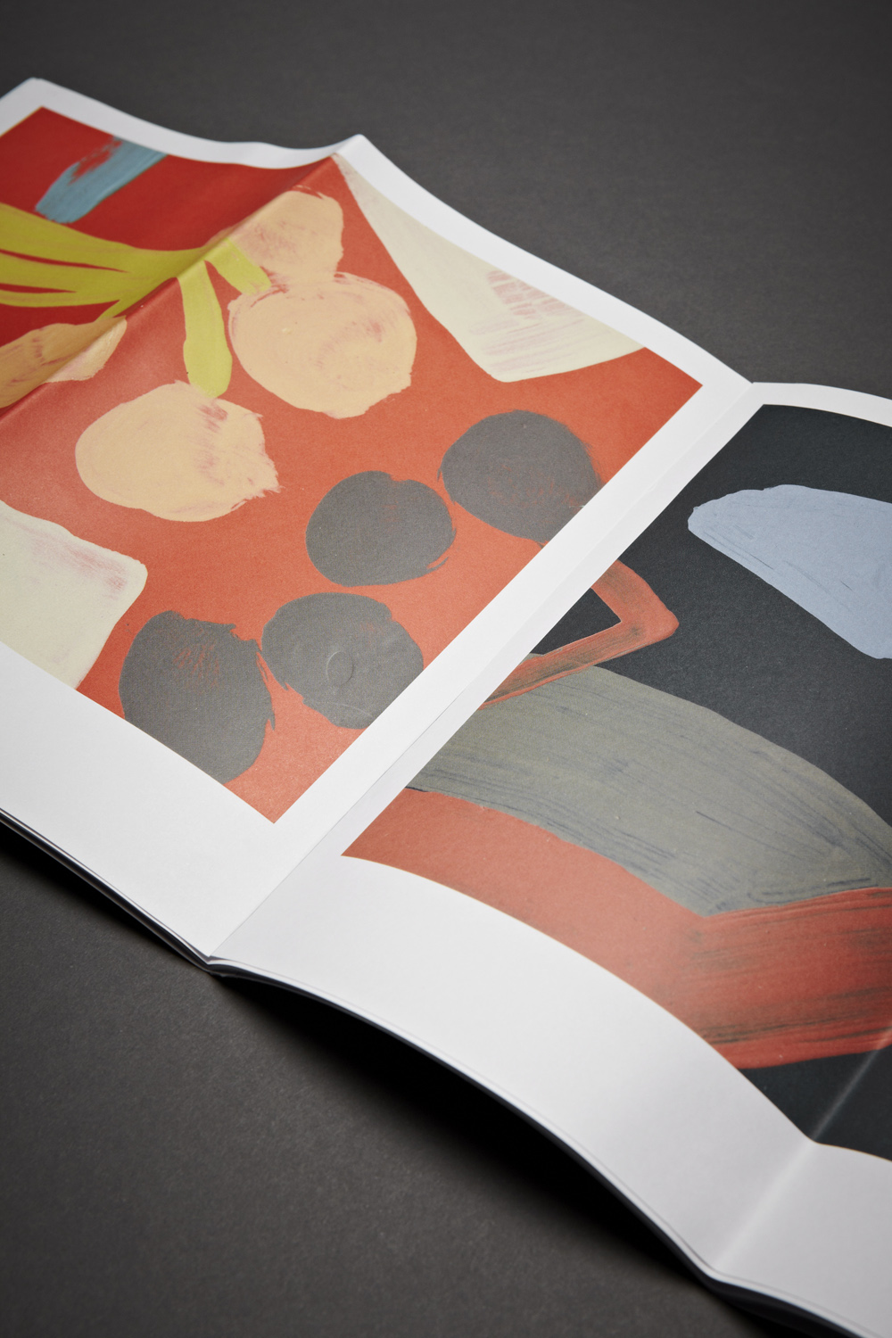
As with all Visual Edition’s publications, there is a border between form and content that has to be constantly negotiated. Many of the contributors provided their own visual material – hand-drawn maps, photographs, diagrams. Of course, in the occasions that it was appropriate to their practice, some produced pieces that are almost entirely image-led. Thus artist Leanne Shapton has created a series of “tablescapes”, topographies of her desk based on descriptions she shares with a friend at the end of email conversations. Others have chosen to challenge the limits of cartography, such as novelist Tao Lin in his mammalian space opera, The Antisocial, Hermetic “Lunar Hamsters”, whose satire is heightened by the faux-naivety of a series of catacombs rendered in MS-Paint.
As visual collateral wasn’t a prerequisite in the brief, however, some proffered only their words. The extent to which the designers would be allowed to, either further or wholly, illustrate the texts thus became a hinge issue. As with all Visual Edition’s publications, there is a border between form and content that has to be constantly negotiated. According to Gerber this usually becomes a circular process between designer and writer, with the two editors conducting in the middle. Compared to their last publication, Kapow!, in which Thirwell (incidentally also represented in Where You Are) and Kerr had to work hand-in hand, the current title was slightly more linear in production, if only because of the number of interlocutors; nevertheless, it is this point of creative friction that is at the heart of each Visual Editions project.
Conductor is only one of the secondary epithets that Gerber and Iversen might use to describe their editorial roles. In this case, Gerber says, the right label would be curator. Where You Are could claim a mixed cultural ancestry, from decidedly literary experiments such as B.S Johnson’s multi-pamphlet novel The Unfortunates, to Chris Ware’s boxed graphic novel Building Stories, the ephemera of which engulfs the reader’s immediate space with its careful pictures, to that near-mythic art world artefact, the multimedia magazine Aspen, essentially a postable art show. Indeed, one could easily construct a private exhibition from Where You Are by arranging its contents around a sufficiently spacious room. This gives a clue as to Gerber and Iversen’s choice of designers: London-based studio Bibliothèque.
While Bibliothèque’s portfolio isn’t heavy on print design, with most output in that area being for commercial clients, their most impressive work in the cultural sector has been in the appointment of several high profile exhibitions. From Cold War Modern at the V&A to This is Design at the Design Museum and the recent Google Web Lab display at the Science Museum, the studio have shown great facility for harmonising an array of contents into one conceptual whole.
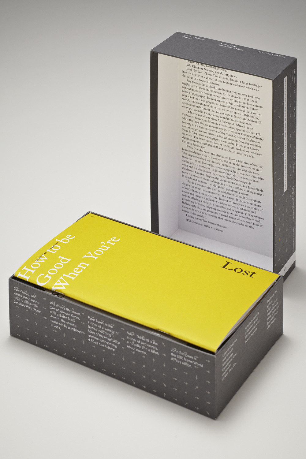
Gerber and Iversen saw this knack for “creating a unifying visual language, while not diluting any of the individuals own character” as the prime credential for this elaborate multipart ‘book’. As the Bibliothèque’s Mason Wells describes it: “There is a very simple framework. The title and author’s name are always consistent , as is the text face, but that is where the consistency stops.” Colour is also used to differentiate, each hue chosen “either based on references from the text or due to functional issues where it was used to delineate geographic or diagrammatic information.” For Wells, the box format was integral to marshalling so many different personalties. “[It] acts like a hub – the perimeter of the outer cover lists all the contributors and these correlate with the inner box so that when it is opened the authors’ biographies are revealed. The challenge was bringing a measured level of expression to each of the very diverse voices and content. It was like designing sixteen individual books.”
The website…takes advantage of the living nature of the web to explore alternative concepts of mapping. Where You Are is in fact even more complex than firsthand experience would indicate. Those who might consider this consciously analogue exploration of mapping an anachronism in 2013 will be heartened to find that its contents also exists beyond the confines of the slate-grey box. www.Where-You-Are.com isn’t just a promotional website, but a full digital realisation of the book itself, produced by young digital design studio The Workers. The website offers all the same contributor content as the printed product but in a format that takes advantage of the living nature of the web to explore alternative concepts of mapping. Gerber describes it as a “bold move”, not just because of its design but because it is completely free to access. The two things are connected: for the website to deliver on its premise then it will need a weight of traffic. Gerber explains: “as you to read the text you will have an awareness of other people on the site reading alongside you, someone from Italy, someone from Australia. This happens all the time of course but the process is never made transparent. We think this included metadata will offer a very different kind of reading experience, it gives the site its reason for being.”