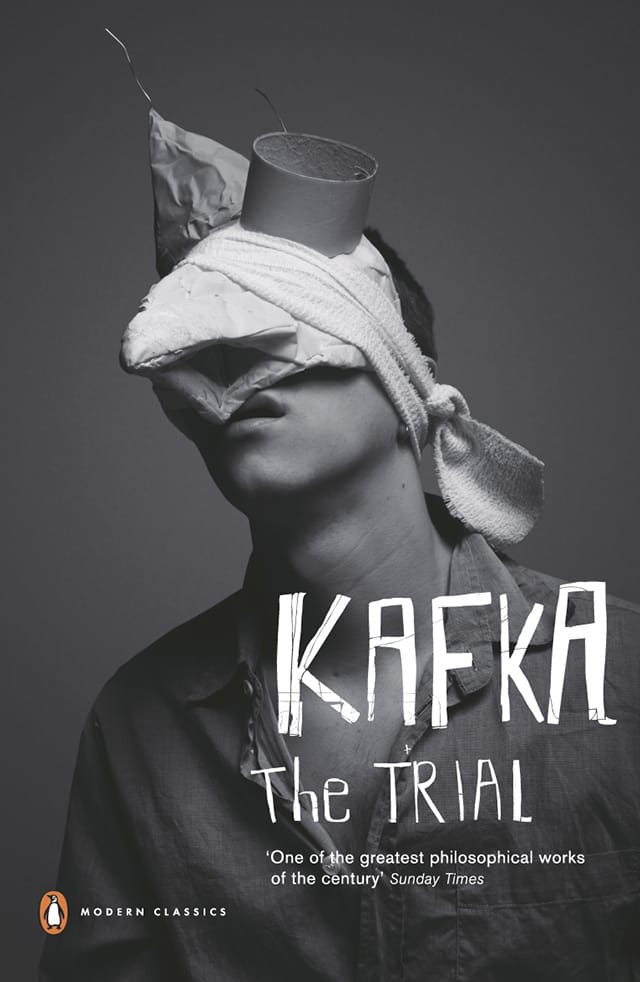
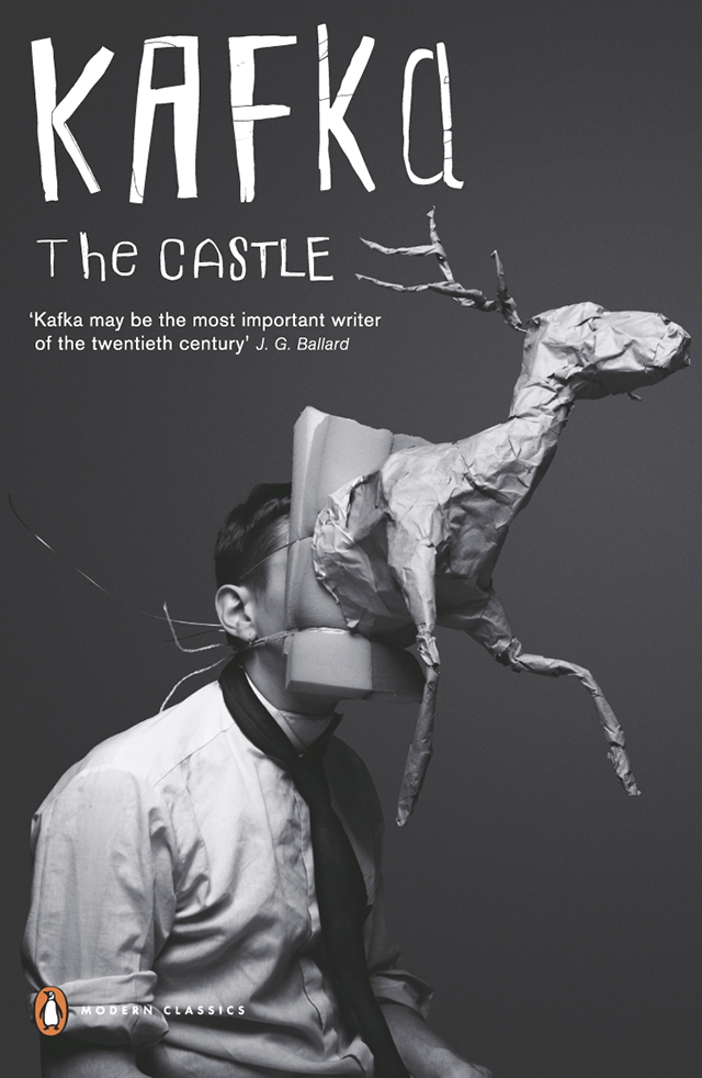
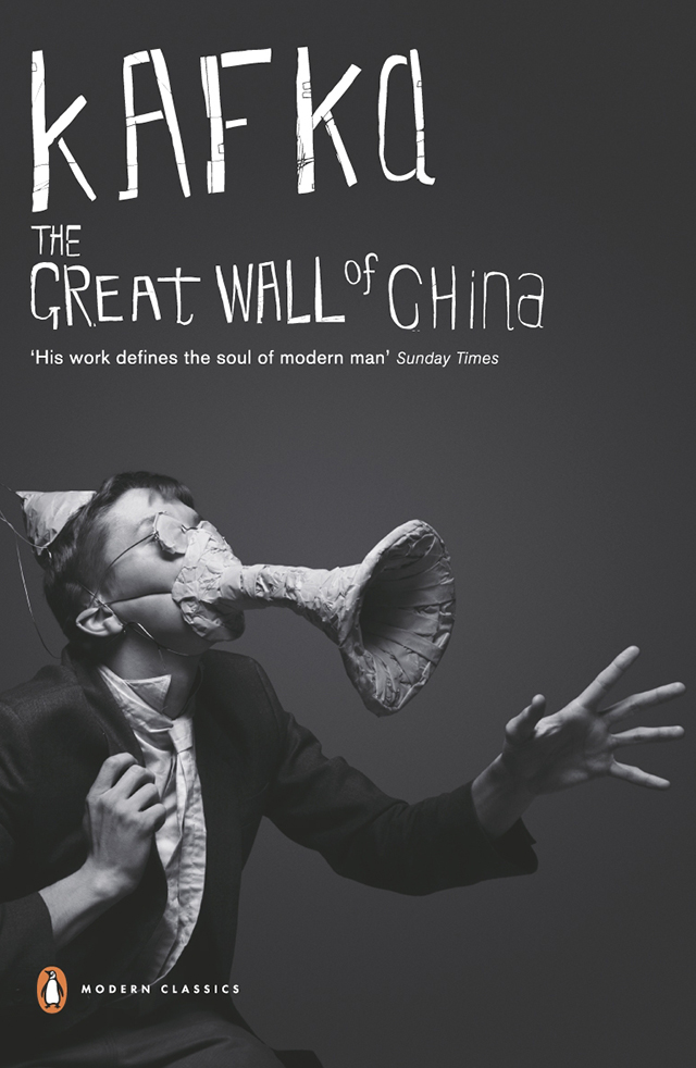
It's not often that a series of book covers stops you in your tracks, but this series for Kafka's Penguin Classics left designer Clare Skeats full of admiration for its unconventional approach. I remember that my first reaction to seeing these covers was one of crushing disappointment. Disappointment caused by the realization that, as a book designer, I could never have arrived at such a brilliant and brave solution.
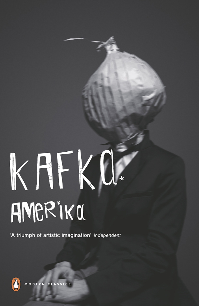
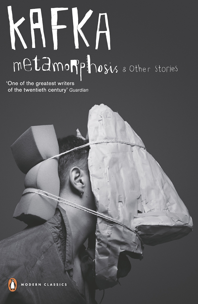
Launched in 2007, the covers – a collaboration between creative agency Mother, and Penguin Press Art Director Jim Stoddart – feature the work of Gary Card and Jacob Sutton. Crucially, the images were not originated for use on the covers but were created independently by (the now hugely successful) Card and Sutton shortly after graduating from Central Saint Martins. Interviewed recently in Varoom! magazine, Card recalls that the photographs were produced in Sutton’s bedroom and that, at the time they had ‘no idea what we were making’. He isn’t even sure how the images came to the attention of Mother/Stoddart, who repurposed them to such spectacular effect for the series. For Card, now a set designer, it was the first commercial use of his work.
The covers present us with scenarios so thrillingly bizarre, they resonate with even the most superficial awareness of Kafka’s writing – which in my view, is part of their success. As a set of images, they have an almost oppressively flat tone – I can’t help but imagine them to be the documentation of some dangerous form of nineteenth-century institutionalized therapy. There is a sense of deranged urgency about the way the props have been created and applied to the model. The honesty of the materials and the crudeness of the making seemed so progressive compared to the contrived book cover photo shoots I was used to being involved with.
This naïve quality is also reflected in the lettering, which dispenses with the author’s first name and instead presents four variations of hand-generated ‘Kafka’s together with accompanying titles. I’ve always loved that the lettering itself looks vulnerable – it seems to reinforce a sympathetic response to the subject of the images. For me they are a perfect package of playful exuberance, experimentation, creative serendipity and risk-taking, and in an age when we are so quick to tire of visual devices, they have lost none of their freshness.
clareskeats.co.uk
Clare Skeats...
Clare is a London-based designer who specialises in book design and art direction. She worked inhouse for Penguin Books, Random House and Margaret Howell before setting up her own studio in 2004. As well as creating beautiful books and book covers, she also also teaches at Central St Martins.
'Kafkaesque'....
Born in Prague, Franz Kafka published very few works during his short lifetime (he died aged forty of tuberculosis). His writing has spawned the term 'Kafkaesque', which is helpfully defined by the Oxford English Dictionary as: ”Characteristic or reminiscent of the oppressive or nightmarish qualities of Franz Kafka’s fictional world.” However if you're tempted to casually slip it into the conversation, be careful – the use of 'Kafkaesque' has now become so ubiquitous that the Urban Dictionary was prompted to describe it as “Overused to the point of meaninglessness, especially if by pseudo-intellectuals.”

