
As Russia flexes its muscles in Crimea, Fuel publishes new tome Soviets, which explores the official fiction and austere reality of life behind the Iron Curtain between 1950 and 1991.
About the project
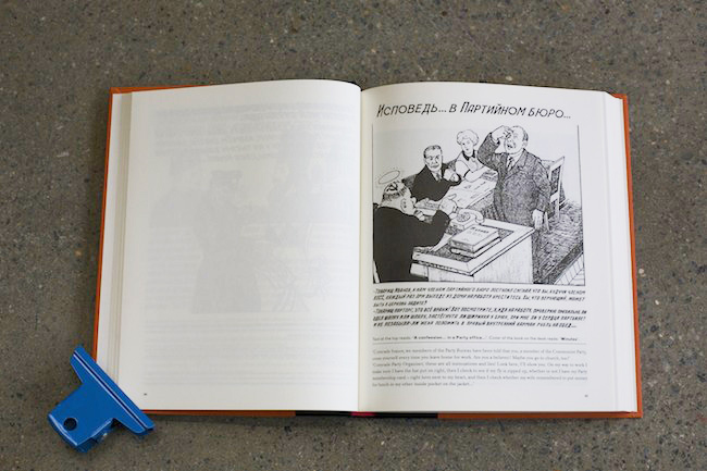
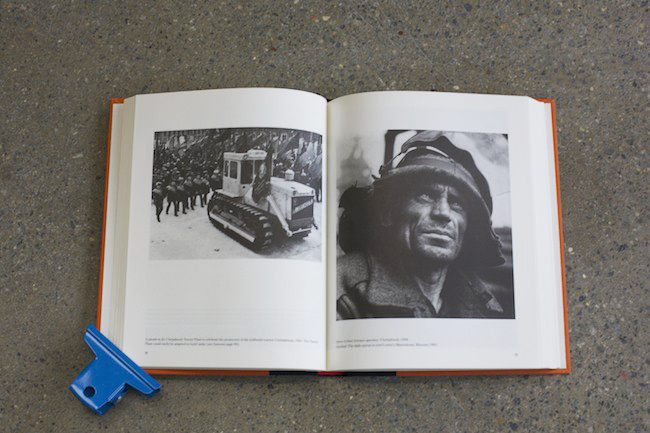
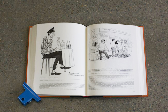
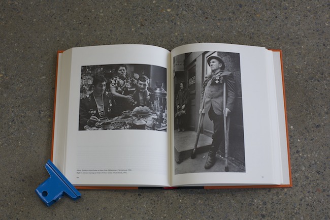
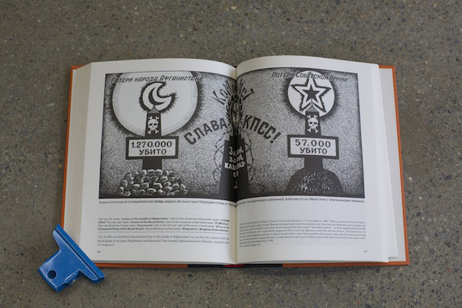
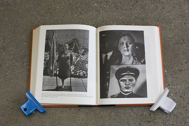
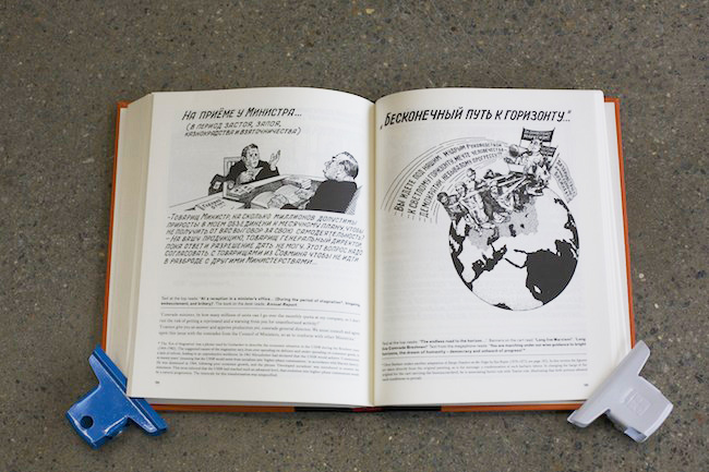
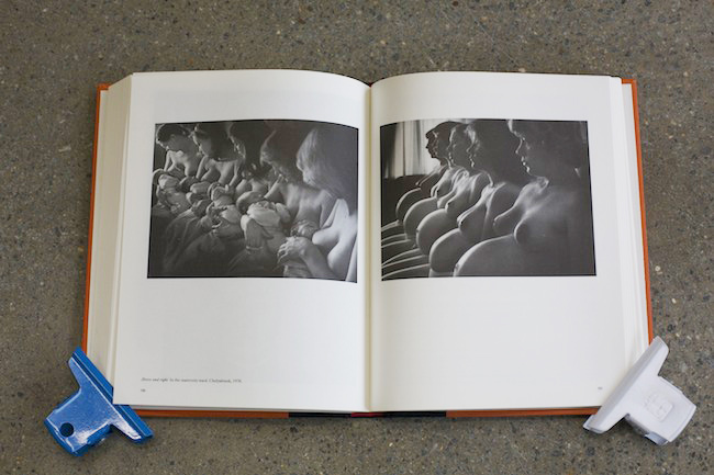
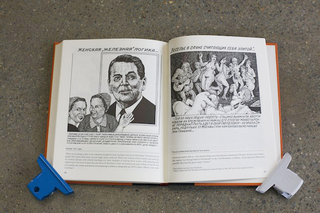
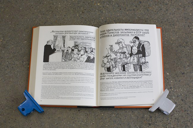
Soviets is a collection of previously unpublished drawings from the archive of Danzig Baldaev, alongside classic propaganda photographs made by Sergei Vasiliev for the newspaper Vercherny Chelyabinsk. Both Baldaev and Vasiliev worked for the authorities as a prison guard and a newspaper photographer respectively. In this way, as with the majority of Soviet citizens, their views were officially tempered and controlled. The officially sanctioned press photographs of Sergei Vasiliev illustrate the ubiquitous State-endorsed fantasy: a parallel universe where Communism was continually undergoing construction, and targets were always being exceeded. By contrast Baldaev’s drawings express the reality of a country exhausted by everyday absurdity, prejudice and corruption. Acutely aware of how dissidents were crushed, Baldaev nevertheless continued to draw. But he also cautiously ensured that his catalogue of fury and mockery against the system’s failures remained an utterly private protest – a paradox that goes some way to summarising the Soviet condition.
How did the project originally come about?
We first became aware of Baldaev and Vasiliev’s work in 2003 when we were shown Baldaev's criminal tattoo drawings by a friend in St Petersburg. We immediately realised these incredible drawings of tattoos and their hidden meanings would make a great book. As we were working on the first Russian Criminal Tattoo Encyclopaedia, we felt the book needed additional photographs of the tattooed prisoners, to help document and validated Baldaev's drawings. We had seen a few of Sergei Vasiliev's images and managed to track him down and select more of his photographs to use throughout the three volume series. These hugely popular books have gone on to be our best sellers.
At the same time as we were producing Drawings from the Gulag, we were given more material by Baldaev's widow which didn't fit into any specific category. It was a mixture of sketchbooks, notes and drawings examining and criticising different aspects of Soviet life. The Gulag book really opened our eyes to the singularity and incomprehensibility of the Soviet system. Once we had finished this book, we better understand the rest of Baldaev's material – it went some way to explaining the strange procedures and attitudes that were so foreign to us. His drawings were a release for his own frustration with the system he was part of.
What was the concept behind the design?
The book follows a template first started with the Russian Criminal Tattoo Encyclopaedia series, then adapted for Drawings from the Gulag. The size has been chosen to feel more like a novel than an art book. Obviously the design of the book has visual appeal, but with this series it was equally important that it conveyed our ability as graphic designers to edit and compose the material into a compelling piece of evidence (following the publication of the Gulag book the drawings it contained have been recognised and authenticated by the Centre for Holocaust and Genocide Studies in The Hague). The book is designed to be dense and intriguing, revealing a hidden history without the feeling of a history lesson.
Did this project present any particular challenges, and if so how were these overcome?
Initially the overall breadth of the project was daunting. At first we weren't sure how to tackle such varied material. Previously our Russian books had focussed on very particular subjects, purposefully disregarding anything extraneous. However, when we realised the material encompassed so many aspects of the Soviet experience, we understood that the extent of it was actually the most important feature, it reflected the period perfectly and became the reason for making the book.
The other challenge was on the editing side, in particular writing the footnotes. The process of translation and editing was a long one: some of the drawings were completely opaque – their meanings had been lost in the period between the fall of communism and now. This meant that simply reading a direct translation was meaningless. We used a number of sources (Russian friends, books and articles, etc) to reveal possible interpretations and made editorial decisions by corroborating these explanations.
The book took around two years to complete. When it was finished we realised there were many comparisons with current issues in Russia today: government corruption, drinking, dissent and race. The publication was not intended to coincide with anything in particular, although 2014 is the UK-Russia Year of Culture. However with Russia flexing its muscles in Crimea and demonstrators being shot on the streets of Kiev, the book is an apposite warning of the dangers of the 'Soviet-style' leadership Putin seems to favour.
What do you think has worked particularly well?
I think the way the photographs break the chapters works particularly well, giving the book pace, and relieving the reader from the madness of the drawings. The simple and consistent layout makes it easy to comprehend what's going on even if the images (and particularly the cyrillic text) seem baffling initially. The design makes it possible to read the book in different ways – to either just dip in, or go for a more intense experience.
Technical spec
The font on the cover follows through from the Tattoo and Gulag books, linking it into the series. Without wanting to sound too cheesy, we went for a 'vintage red' colour as a visual representation of the rusting, crumbling Soviet system. For reasons of cost, we print all our own books in China. We often use uncoated paper which has a lovely tactile quality for the cover and compliments the cloth spine. The pages are printed black on a lightweight cream wood free paper.
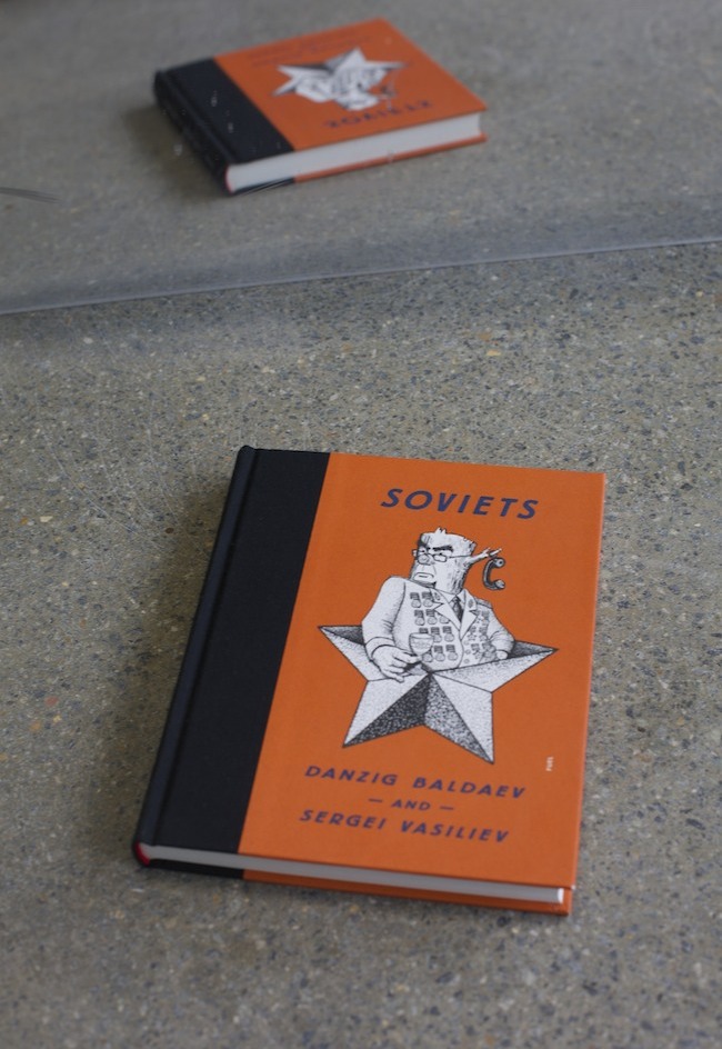
Title: Soviets: Danzig Baldaev and Sergei Vasiliev
Publisher: Fuel
Translation: Polly Gannon and Ast A. Moore
Date published: March 2014
fuel-design.com


