Yah-Leng Yu of Singapore-based design agency Foreign Policy praises Experimental Jetset for their mould-breaking responsive identity for the Whitney Museum.
Even as a designer myself, I am always curious to know what goes through the minds’ of other designers when they get a brief – to know what the visual forms are that first materialise there and to know how they evolve into a fully realised visual identity. Often, the most effortless and simple forms speak to me the loudest but I know it is by no means an effortless task to distill a simple, pure form that works and sings the story of the brand.
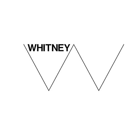
Personally, I am a big fan of the simple, responsive ‘W’ logo designed by Experimental Jetset for the Whitney Museum. The plastic quality of the ‘W’ in this identity takes the museum’s visual communications in a different direction to the stable and static logotype designed by Abbot Miller of Pentagram thirteen years back. With the Whitney going through changes and moving downtown from their Upper East Side address, it made sense to rebrand and to do so in such a dynamic way.
If we look at the visual form, the minimalist mark is built around a thin, elastic ‘W’ zigzag that responds to format and the surrounding text and images. I feel that it is a metaphor for expressing the history of art – an ever evolving and changing style from era to era. It also expresses the ever changing nature of the Whitney Museum.
I really like the way that the dynamic system of the responsive ‘W’ opens itself up to endless possibilities in terms of application. It is very intuitive and can be applied to any collateral easily without intruding artwork. Graphically, the mark makes a strong impact and allows one to quickly grasp the personality of the museum and its outlook for the future; it conveys a sense that the Whitney will not be a boring institution but one that is always staying ahead of the curve or, in this case, zigging ahead of the zag.
One most important, game-changing things about this identity is that the ‘W’ breaks the rule that a logo should always remain consistent to build brand recognition. Experimental Jetset have done something extremely difficult in pulling this identity off so elegantly while breaking conventional rules. The dynamic nature of the ‘W’ is not only created for physical collateral materials, we see it on the museum’s website as well. If you take care to resize your browser while on their website, the ‘W’ changes with it. It’s small details like this that only great designers take care of and execute quite so expertly.
foreignpolicydesign.com
Foreign Policy
…craft, realize, evolve and elevate brands with creative and strategic deployment of ideas narrated through a mix of appropriate media. Whether the problem is a new identity or a brand refresh, a product, a space or something technological, Foreign Policy can solve it, as evidenced by their elegant identities for China’s Sifang Art Museum and the online gallery, The Artling.
The Whitney Museum
…is an art museum in New York City that focuses on 20th and 21st century American art. It was founded by heiress Gertrude Vanderbilt Whitney (1875-1942) in 1931. The museum has been closed recently while a move has been undertaken between the Whitney's old Marcel Breuer designed building and a new, larger Renzo Piano designed space. It is due to re-open on 1 May 2015.


