
Unconstrained by discipline and with a focus on the unexpected, Works That Work is a design magazine with a difference. Grafik caught up with Works That Work and Typotheque founder Peter Bil’ak to find out more.
What was the original idea behind the magazine?
My background is in design, but I admit that I read very few design-related publications. I've always felt that design discussion stays within an impenetrable bubble – designers write about design (or other designers) for an audience of designers, and make little effort to make the discussion relevant for a wider audience. When I finally have time to read, I don't want to read about a well-known designer doing a new project for a well-known client, I want to read about something that I've never heard about before, but which is still relevant for my work. I want to learn something new, but the design magazines feed me with more of the same. That's why I started Works That Work (WTW): to extend the design discussion, to make it relevant for non-designers and, moreover, to allow myself to keep learning about fascinating things from around the world.
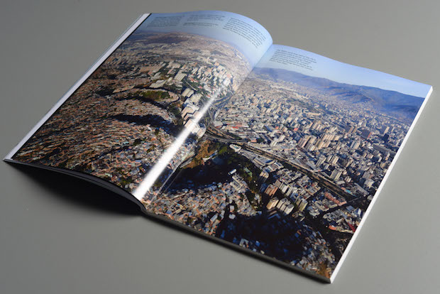
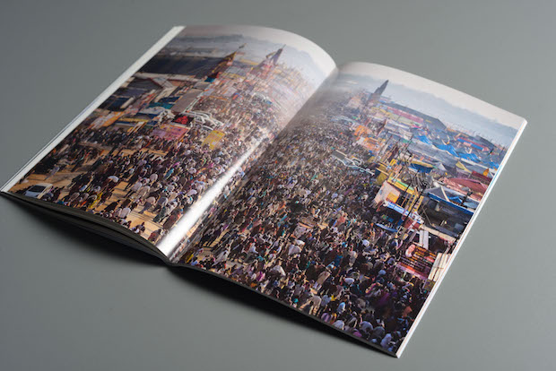
When I go out with my friends (from different professions) I don't talk about logos and kerning, we talk about stuff that interests us all. About a Japanese construction company that exists for 1400 years and how it manages to in an age when we can't plan two years ahead; about a 410km-long tunnel under Austria that Czechs wanted to dig to bring them to the sea; about the largest temporary city in the world that accommodates more than London, Paris and New York combined, about tattoos that Dutch pensioners put on their chest to decide their own fate, or an Indian man that wore sanitary napkins and improved the lives of millions.
Could you give us a brief outline of how Works That Work has progressed from the initial idea to the magazine it is now?
Some time in spring 2012 I started thinking about a publication that I would love to read myself, making notes about its content. When I had over fifty different subjects noted, I felt confident that it was something worthwhile to do. A magazine today needs to present real value to the readers. There is so much to do and read, that if I ask my friends to read something, it better be worth it.
After preparations (setting up a payment and production system), we created our own crowdfunding site, and in October 2012, we launched a thirty day campaign.
Within thirty days we had raised over €30,000, and in February 2013 the first issue was published. Since then, the magazine has been fully supported by its readers, with no external funding. Readers finance it, publicise it and help to distribute it. That’s why we consider our readers our investors and strive to be completely transparent with them, and publish regularly our financial details.
You changed how the magazine was bound after two issues, could you talk a bit about why that was?
The original binding was simple staples, which we loved, but appeared to devalue the magazine (which is fairly expensive). See the video, comparing it to perfect binding.
We tried to look at the most functional binding possible, and switched, as the number of pages was growing. Otabind is a fantastic method that very few people know about. It is my understanding that you can't produce books like this in the UK, there are very few binders who can do it, and one of them is close by in the Netherlands. It is a small, nearly invisible component of the magazine, but it allows reading the magazine with one hand, making the experience a little more pleasant.
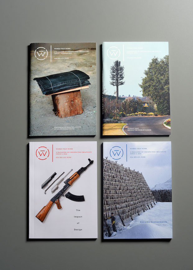
You designed the typeface family Lava specifically for the magazine. What is it about Lava that makes it appropriate for WTW?
Very early I decided on the format of the magazine, which is more of a book than a magazine. I also knew that the articles would be rather long, between 2000-5000 words, so we needed a typeface that makes the reading comfortable, yet gives an identity to the magazine.
More importantly, the magazine stretches across multiple platforms (online, eBook, PDF and print) where the format, colours, proportions change. The only the sole constant characteristic, identifying the magazine regardless of whether a reader purchased a single article on a mobile phone or a complete issue in print, is the typeface. Lava was designed to perform optimally in both high and low resolution environments and it delivers something that typical user interface fonts usually lack: refined details, finely tuned proportions and meticulous spacing, letting the reader forget about the typeface and pay attention to the text.
Was it essential for you to have the magazine both in print and online?
All magazines today are produced digitally, even when they are printed. All text and images are digital, so it is possible to make a digital version alongside the production of the print magazine. We have developed our own editorial system for online collaboration between authors, editors, translators and designers. Only one version of the text is kept online, (although every change is tracked and commented), so there is no confusion about which version is the latest. The system uses a simple markup system to create the basic text hierarchy (headlines, descriptions, main text, images, captions), and this source data is then converted to styled HTML, EPUB or even InDesign documents using stylesheets. This streamlined production system enables all proofreading to be done online before the material becomes medium-specific, so there is no need to specially proof the ebook or website editions.
Many of our readers purchase the hybrid edition of print and digital: print for the long form reading, digital for archiving, searching and retrieving possibilities.
You’ve encouraged the readers of Works That Work to aid the distribution of the magazine through what’s referred to as ‘Social Distribution’. Could you tell us more about this?
Because Works That Work magazine is financed by magazine sales rather than advertising, we had to establish an alternative distribution model. Traditional distribution networks typically take the largest part of the cover price and even control where publications will be sold and for how much. We decided to pay our readers, not an army of middlemen, to help distribute the magazine.
Shipping costs, for example, contribute significantly to the cover price of a magazine, so we also collaborate with readers who volunteer to deliver the magazine to other readers. When their travel plans coincide with delivery needs, readers can help reduce the cost of shipping the magazine, making it more affordable for everyone. WTW’s website features a travel database where readers can sign up to help deliver magazines, entering their destinations, travel dates and amount of free space in their luggage. Besides efficient distribution and delivery, this approach also creates an engaged community of magazine readers.
How do you see WTW developing in the future?
It is still early days, we need to grow a little bit to make the project really viable. Currently we work in a small team, and eventually we need to hire a full-time staff. I'd love to make more use of video, but at the moment, we simply can't afford it. A long way to go still, but we love what we do, and the magazine is like a drug: if you read one issue, you are hooked.
worksthatwork.com
typotheque.com