
An accomplished typographer, Edward Wright was also a concrete poet, printer, painter, collagist, exhibition designer, historian of Modernism, writer and teacher. Here, Theo Inglis pays tribute the greatest British designer you've probably never heard of. Typography is so often about the ‘what’ or the ‘how’, rather than the ‘why’. Throughout the 20th century experimental typefaces like A.M. Cassandre’s Bifur; Paul Renner's original version of Futura, Josef Albers’ Kombination-Schrift and Wim Crouwel’s New Alphabet pushed the boundaries of legibility. Their aim was to create recognisable but aesthetically new letterforms, this concern remained relevant throughout the post-modern period of graphic design and into the present day. Making fresh versions of twenty-six ubiquitous letters remains an intriguing puzzle in itself.
What then makes the typeface that I know only as ‘Alphabet for a study in legibility, 1963’, by Edward Wright, any different? There is something somewhat primitive about it, yet also futuristic in a constructivist kind of way. Why the little quirks, such as the gap between the bowls of the B, or the triple kink of the 3? Having digitised it for a personal project I know these little things do make it very distinctive, yet Wright also had another motive...
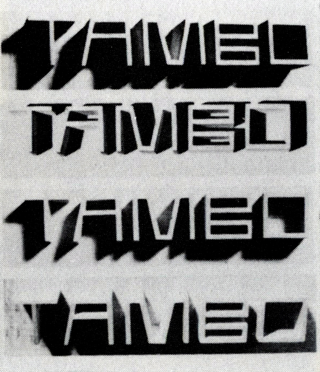
These letters were conceived as structural units, existing in three dimensions, with depth an intrinsic part of their aesthetic. This in itself seems quite a minor point, but even today the majority of typefaces are conceived as two dimensional forms, consistently the same whether seen on screen or in print. Unless the graphic designer takes liberties, or goes badly wrong, the typographers’ vision remains sacred, hermetic even. The only photograph of Wright’s experimental alphabet in use, a sign which says ‘TAMBO’, shows that he was primarily interested in experimenting with the visual effects of real world environmental context. Both the angle from which it is seen and the direction of lighting drastically alter the look and impact of the lettering.
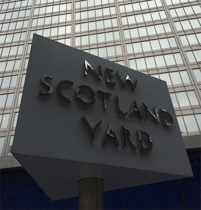
This idea became more fully formed in Wright’s work on one of the most well know pieces of signage in Britain, the rotating triangular sign at New Scotland Yard – London’s police headquarters. Here the highly polished and raised chrome letterforms of his typeface ‘Flaxman’ create an intriguing interplay between light and shadow as the sign rotates. Given that this is such a unique and iconic piece of work it is a shame that Edward Wright remains a little known figure in the history of graphic design.
His contribution to architectural lettering is even more impressive when you think that even today many architects do not consider signage particularly important. Also he was working in the decades following the Festival of Britain, when traditional Egyptienne serif typefaces like Stymie Bold Italic and Profil were ubiquitously bolted onto modern concrete buildings across the land. Wright’s influences and reference points were far more varied and esoteric than the majority of graphic designers active in this period – he was well versed in avant-garde Modernism, trained as an architect, was interested in graffiti, ancient and alternative forms of language. He was also extremely intellectually active, being on the periphery of the rebellious ‘Independent Group’ of artists, designers, architects and critics, which was active at the ICA on Dover Street during the 1950s. It is unfortunate that during his career Wright had limited opportunities to collaborate with architects, and that only a few of these symbioses between buildings and typography have survived – the signage at New Scotland Yard, a concrete foundation stone at Churchill College in Cambridge, and three dimensional lettering for the entrance of Tate Liverpool, which was designed in 1988 shortly before his death.
Some of Wright’s obscurity can be put down to his selectiveness about what projects he chose to work on, being a signatory of Ken Garland’s ethical First Things First Manifesto in 1964. But this unjustifiable obscurity is a real shame given how innovative and influential he was. Prolific too – working in many disciplines beyond typography; as a concrete poet, painter, printer, collagist, exhibition designer, historian of Modernism, writer and most of all as a teacher. This pedagogic inclination seems to have dominated his career, having taught typography at the RCA from 56-61, drawing at the School of Architecture in Cambridge from 60-63, been head of the Graphic Design department at Chelsea School of Art from 63-77, and most famously his experimental typography evening classes at the Central School from 52-56. These classes could count Ken Garland, Alan Fletcher, Colin Forbes, Derek Birdsall and Germano Facetti as regular attendees, virtually a role-call of important British designers working in the decade following.
Wright’s dialectical approach to typography and communication - the integration of form, concept and context - evident in his ‘Alphabet for a study in legibility, 1963’, proved highly influential to his many students over the years, earning him their admiration, and rightly so.
theoinglis.com
Theo Inglis…
…is a London based freelance designer and writer. This Norwich University graphic design graduate curates a collection of Mid-Century graphics on tumblr at Mid-Century Modern Design and writes and blogs about design. After three years of working in branding Theo is back in education, studying for an MA in Critical Writing in Art & Design at the Royal College of Art. His main interests are the history of graphic design, typography and books.
New Scotland Yard…
The headquarters of the Metropolitan Police has had various locations within the capital, but is always known as New Scotland Yard. The name derives from the street entrance to the force's original building, which was on Great Scotland Yard. The Met will soon be on the move again, from 10 Broadway back to the Victoria Embankment – to the building which it originally sold to the government in 1967. The new HQ will now be known as 'Scotland Yard' – despite this, Wright's sign is also making the move from the original building, which is (of course) being developed into luxury apartments.